Product Information
What is the Product Information section?
Since v1.0.0Product page
The Product Information section forms the main product page layout, combining the product media gallery with details such as title, price, variant picker, and buy buttons. It supports a customizable sticky or floating buy button, flexible media layouts (including Fashion, Collage, and Masonry gallery styles), and a range of blocks that can be added, reordered, or removed to build the exact product page experience you need.
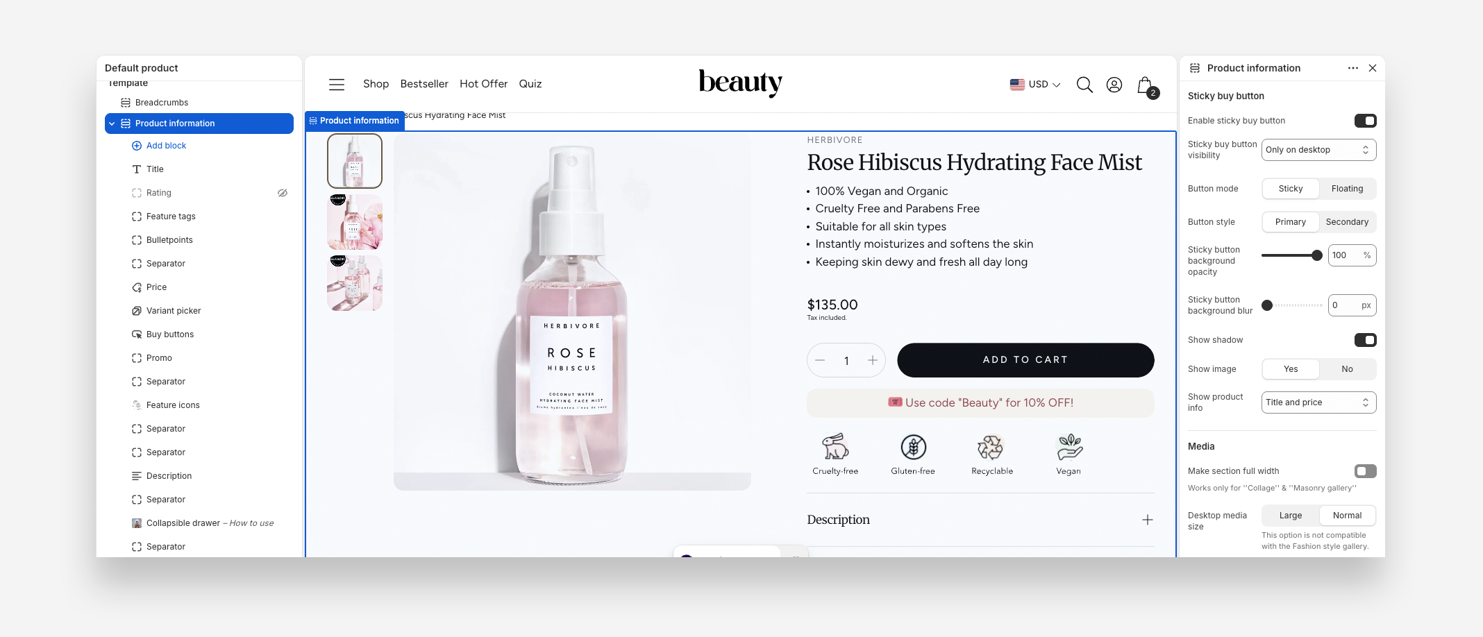
Main Settings
Sticky Buy Button
- Enable sticky buy button: Enable this toggle to display a sticky or floating buy button that stays visible as the customer scrolls.
- Sticky buy button visibility: Choose when the sticky button is shown — for example, Only on mobile.
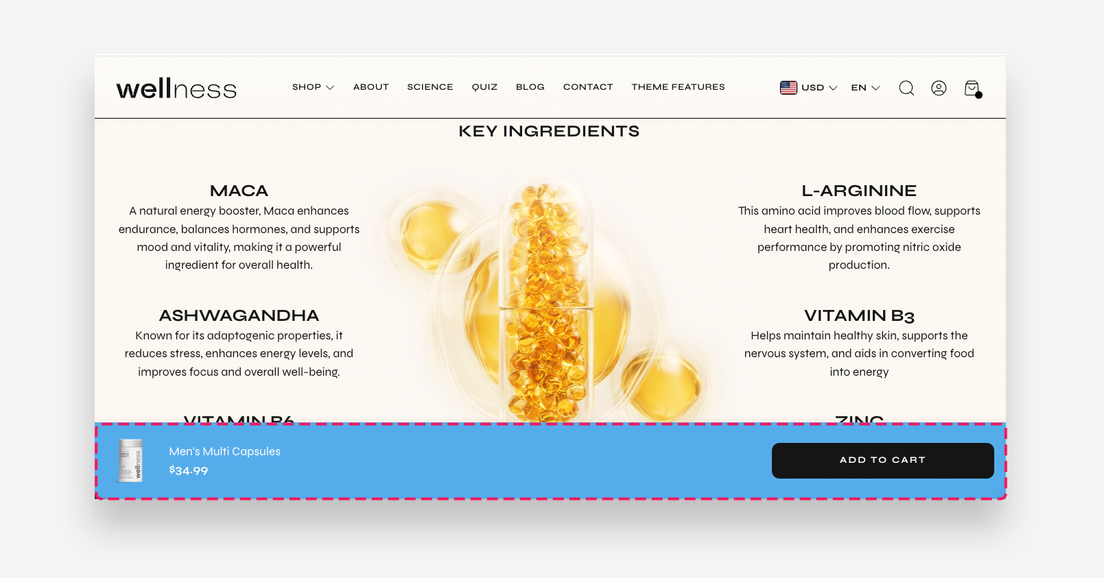
- Button mode: Choose how the button behaves — Sticky or Floating.
- Button style: Choose the visual style of the button — Primary or Secondary.
- Sticky button background opacity: Adjust the opacity of the sticky button's background.
- Sticky button background blur: Adjust the blur effect applied to the sticky button's background.
- Show shadow: Enable this toggle to display a shadow behind the sticky button.
- Show image: Choose whether to display the product image in the sticky button — Yes or No.
- Show product info: Choose what product information is displayed in the sticky button — for example, Title and price.
Sticky buy button example
Media
- Make section full width: Enable this toggle to stretch the section to the full width of the screen. Works only for "Collage" & "Masonry gallery" layouts.
- Desktop media size: Choose the size of the media gallery on desktop — Large or Normal. This option is not compatible with the Fashion style gallery.
- Desktop layout: Choose the layout style of the media gallery on desktop — for example, Fashion.
- Desktop image ratio: Choose how images are cropped in the gallery on desktop — for example, Original Size.
- Enable video looping: Enable this toggle to make product videos loop automatically.
- Preselect first available variant: Enable this toggle to automatically select the first available variant when the page loads.
- Enable image zoom: Enable this toggle to allow customers to zoom in on product images.
Video Controls
- Show default video controls: Enable this toggle to display the default play/pause and mute controls on videos.
- Show custom play/pause button: Enable this toggle to display a custom play/pause button on videos.
- Show custom unmute button: Enable this toggle to display a custom unmute button on videos.
Mobile Version
- Mobile image: Choose the size of the media gallery on mobile — Normal or Small.
- Show thumbnails on mobile: Enable this toggle to display image thumbnails below the gallery on mobile. Works only with Carousel layout.
Colors
- Text and UI element color: Set the color of the text and UI elements in the section.
- Background color: Set the background color of the section.
- Arrow background color: Set the background color of the gallery navigation arrows.
- Arrow background opacity: Adjust the opacity of the arrow background.
- Arrow icon color: Set the color of the arrow icons. If not set, inherits from the section background color.
Section Spacing
- Distance from the top: Adjust the spacing above the section.
- Distance from the bottom: Adjust the spacing below the section. Adds distance from the top and the bottom.
- Show custom mobile spacing: Enable this toggle to set separate spacing values for mobile devices.
- Distance from the top mobile: Adjust the spacing above the section on mobile devices. Applied only when Show custom mobile spacing is enabled.
- Distance from the bottom mobile: Adjust the spacing below the section on mobile devices. Applied only when Show custom mobile spacing is enabled.
Blocks
Inside the Product Information section you can add, reorder, and remove blocks — such as the title, price, variant picker, buy button, description, and upsell blocks — to build the product page layout you need. Each block has its own settings, documented in Blocks.