Search Results
Search Results
Since v1.0.0
The Search Results page displays products, articles, and pages matching the visitor's search query. It includes a product grid with filtering and sorting tools, and is available on the Search template. To edit this section, select the Search template from the template switcher at the top of the editor.
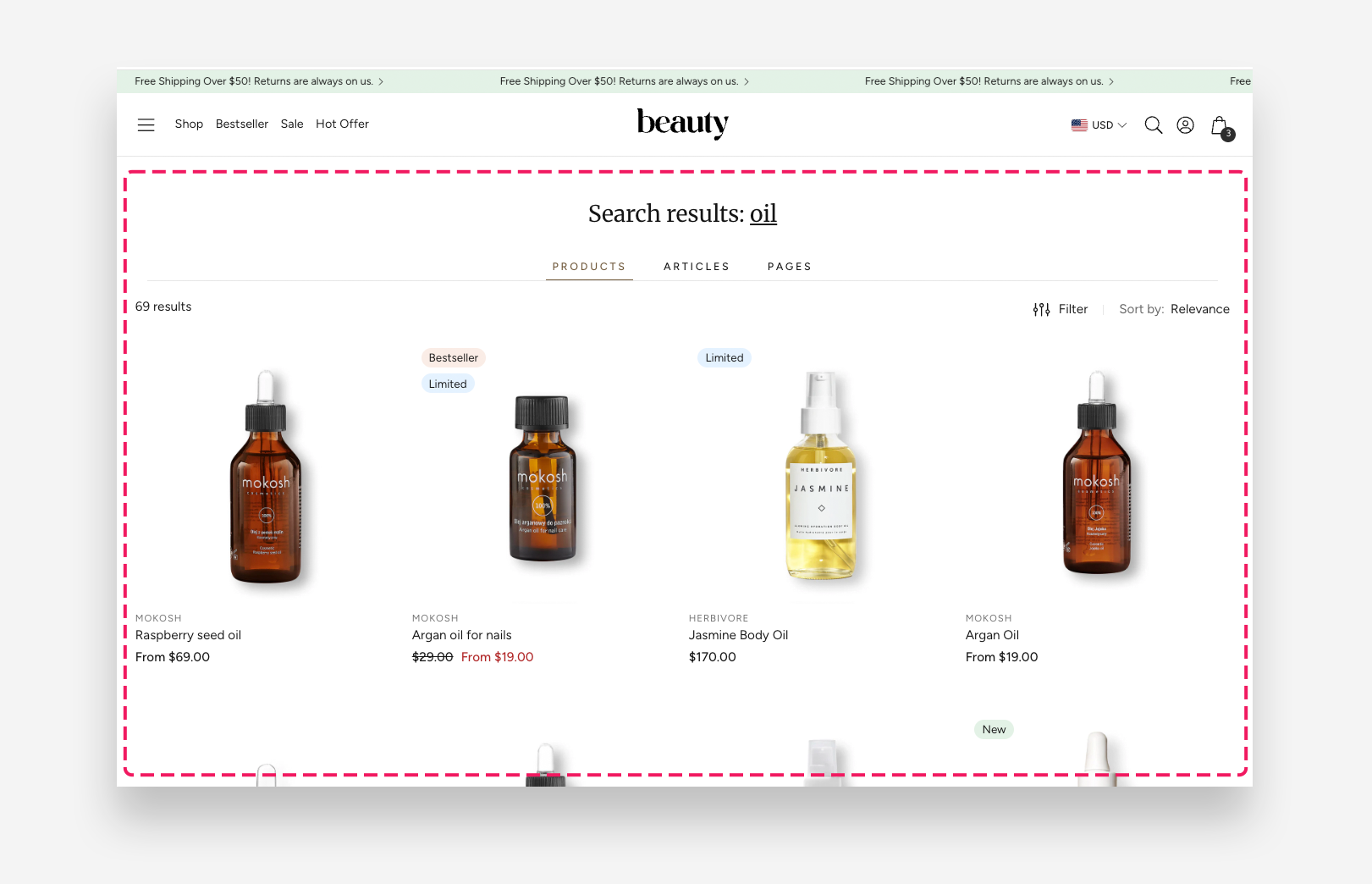
Main Settings
General
- Products per page: Set the number of products displayed per page in the search results grid.
- Number of columns on mobile: Choose between 1 or 2 columns for the product grid on mobile devices.
- Number of columns on desktop: Choose between 3 or 4 columns for the product grid on desktop.
- Spacing between products on desktop: Set the gap between product cards on desktop — 8px, 16px, or 24px.
- Make section full width: Enable this toggle to stretch the section to the full width of the screen.
Categories
- Show articles: Enable this toggle to display matching blog articles in the search results.
- Show pages: Enable this toggle to display matching pages in the search results.
Mobile Version
- Spacing between columns on mobile: Set the gap between product cards on mobile — 4px, 8px, 12px, or 16px.
Product Card
- Card style: Choose the style of the product card — Classic or Pro. Pro style adds an in-card image gallery and a quick buy button.
- Max gallery images (Pro style only): Sets how many product images are shown in the in-card gallery.
- Enable quick buy picker (Pro style only): Adds a size picker directly on the product card. Replaces the standard quick add-to-cart button.
- Text alignment: Set the alignment of product text — Center or Left.
- Image ratio: Choose the aspect ratio of product images in the grid — for example Square.
- Show second image on hover: Enable this toggle to display the product's second image when hovering over the card on desktop.
- Show vendor: Enable this toggle to display the product vendor name on each card.
- Enable vendor link: Enable this toggle to make the vendor name a clickable link.
- Show product rating: Enable this toggle to display the product rating on each card. To display a rating, a product rating app is required.
- Show review count: Display the numeric rating value next to the stars on product cards and search results.
- Hide rating if no reviews: Hide the rating on a card if the product has no reviews yet.
- Enable quick add button: Enable this toggle to display a quick add to cart button on product cards. Recommended for lower-priced items to facilitate quick shopping.
- Desktop button position (Classic style only): Choose where the quick add button appears on desktop — Below product or On hover. (Only shown when "Enable quick add button" is on.)
- Content (Pro style only): Optional page shown in the size guide popup (title + content), below the table.
For the full Classic vs Pro breakdown, see How to Set Up a Product Card. Pro card swatches rely on product siblings — see How to Set Up a Product Siblings (Product Variations) Block in Product Page.
Toolbar
- Enable sorting: Enable this toggle to display the sort order dropdown above the product grid.
- Enable filtering: Enable this toggle to display the filter options above the product grid. Filters can be customized via the Customize filters link.
- Filters position: Choose how the filter panel is displayed — Always visible or Drawer.
Section Spacing
- Distance from the top: Adjust the spacing above the section.
- Distance from the bottom: Adjust the spacing below the section.
- Show custom mobile spacing: Enable this toggle to set custom spacing values specifically for mobile devices.
- Distance from the top mobile: Adjust the spacing above the section on mobile. Applied only when Show custom mobile spacing is enabled.
- Distance from the bottom mobile: Adjust the spacing below the section on mobile. Applied only when Show custom mobile spacing is enabled.