Featured Blog
What is the Featured Blog section?
Since v2.4.0
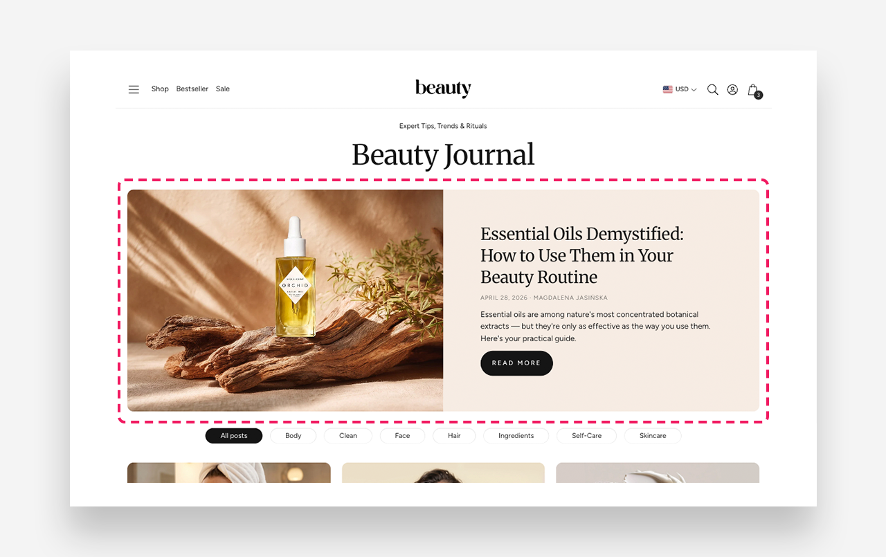
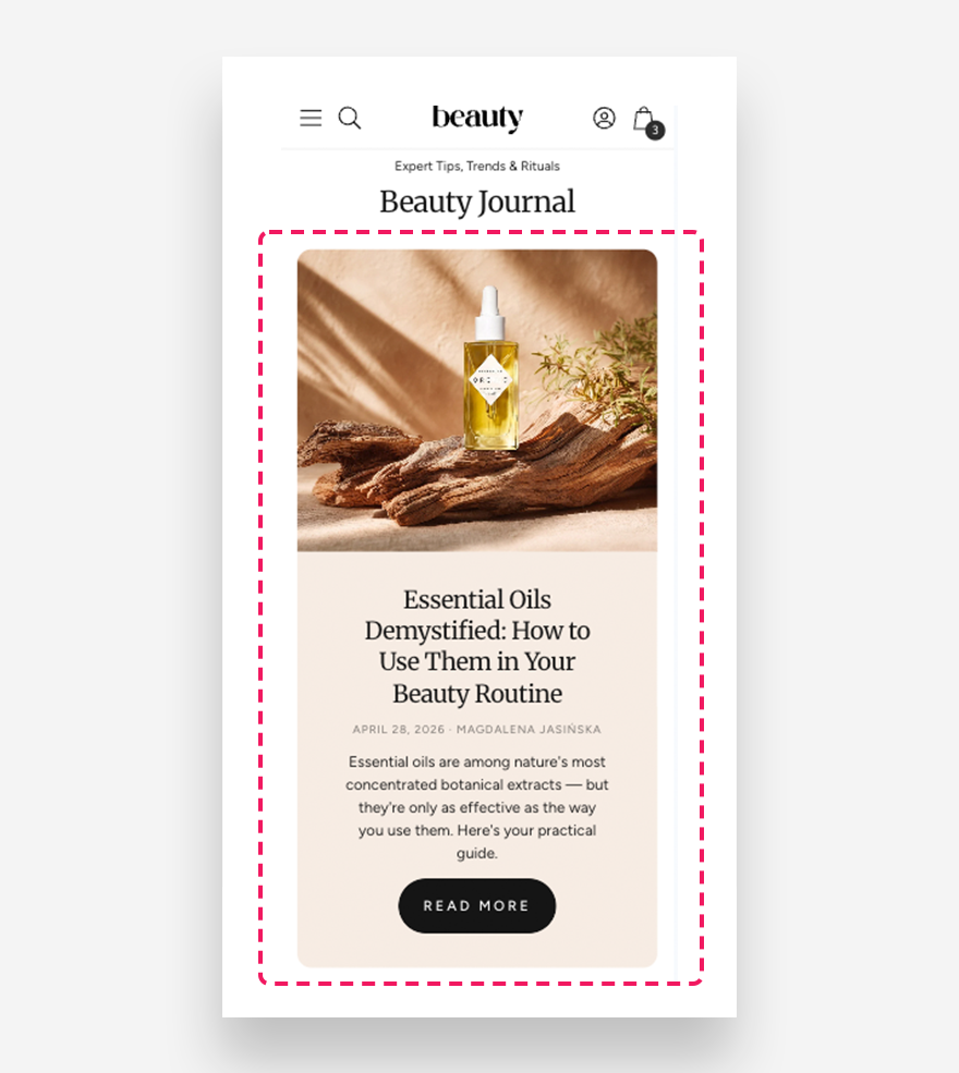
The Featured Blog section displays a highlighted blog article in a large, visually prominent layout combining an article image with its title, excerpt, date, and author. It is ideal for drawing attention to a specific post or automatically showcasing the latest article from a selected blog.
Main Settings
General
- Blog — Select the blog from which the latest article will be automatically displayed.
- Select article manually — Choose a specific article to display. When selected, this overrides the latest article setting above.
- Show article excerpt — Enable this toggle to display a short excerpt from the article below the title.
- Show date — Enable this toggle to display the publication date of the article.
- Show author — Enable this toggle to display the author's name on the featured article.
- Desktop layout — Choose the layout order of the image and content on desktop — Image first or Text first. Image first is the default mobile layout.
- Desktop percentage image width — Define the width of the image column relative to the section on desktop.
- Make section full width — Enable this toggle to stretch the section to the full width of the screen.
- Show content below image on desktop — Enable this toggle to display the article content below the image instead of beside it on desktop.
Button
- Button label — Set the text displayed on the read more button.
- Style — Choose the visual style of the button.
Section Height
- Height — Choose between Adapt to image, which adjusts the section height based on the article image, or Fixed height, which sets a specific height regardless of the image.
- Desktop fixed height — Define the fixed height of the section on desktop. Applied only when Fixed Height is selected.
- Mobile fixed height — Define the fixed height of the section on mobile devices. Applied only when Fixed Height is selected.
Colors
- Section background color — Customize the background color of the entire section.
- Background opacity — Adjust the opacity of the section background color.
- Text color — Define the global text color for the section.
- Background container color — Set the background color of the content container displayed alongside the article image.
- Background opacity — Adjust the opacity of the content container background color.
Large Screen Version
- Heading scale large screen — Adjust the font size of the article heading on large screens.
- Large screen text alignment — Set the vertical alignment of the content on desktop — Top, Center, or Bottom.
- Horizontal alignment — Set the horizontal alignment of the content on desktop — Left, Center, or Right.
Mobile Version
- Heading scale mobile — Adjust the font size of the article heading on mobile devices.
- Mobile screen text alignment — Set the horizontal alignment of the content on mobile — Left, Center, or Right.
Section Spacing
- Distance from the top — Adjust the spacing above the section.
- Distance from the bottom — Adjust the spacing below the section.
- Show custom mobile spacing — Enable this toggle to set custom spacing values specifically for mobile devices.