How to Set Up a Product Card
How to Set Up a Product Card
The product card is the small preview of a product that appears anywhere the theme shows a grid or row of products — the collection page, search results, Featured collection, Product recommendations, and more. It's the image, title, price, and rating that customers click to reach a product.
Wonder gives you two card styles that you switch between with a single setting:
- Classic — the standard card: one image (with an optional second image on hover), title, price, rating, and an optional quick add button.
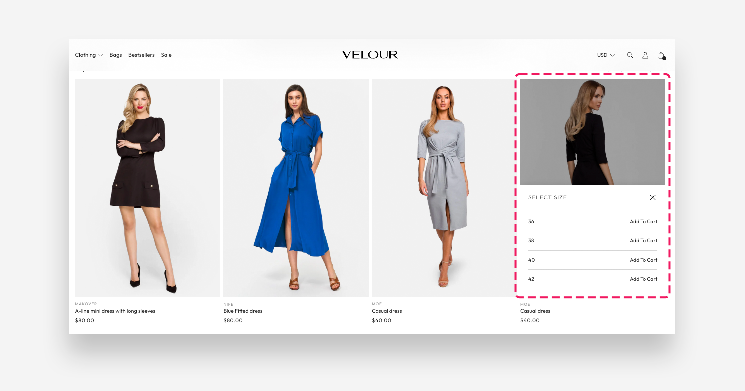
- Pro — everything Classic has, plus an in-card image gallery customers can browse without leaving the page, sibling/variation swatches (combined listings), and a new inline quick buy picker with an optional size guide.
Both styles share the same core settings (image ratio, vendor, rating, and so on). Pro simply layers extra shopping features on top.
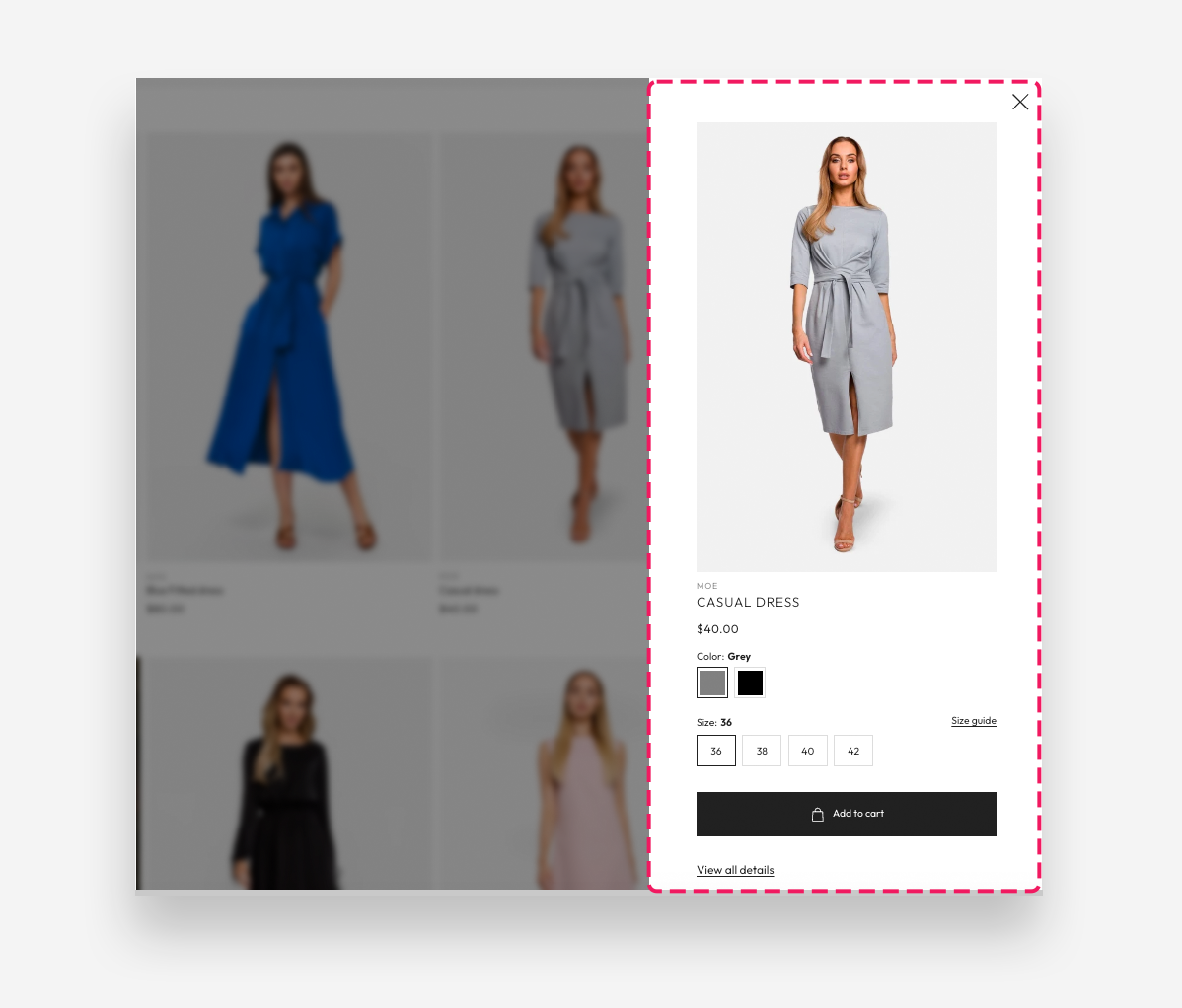
The inline quick buy picker only appears on products that have exactly one option — for example a t-shirt with just Size. A product with two or three options (for example Size + Color) opens the standard quick add drawer instead. This is by design: an inline picker can't represent a combination of options. See When the picker appears — and when it doesn't for the full breakdown.
Quick buy picker
Quick add drawer
How to switch the card style
- In your Shopify admin, go to Online Store > Themes.
- Click Customize on the theme you want to edit.
- Open the page (or template) that shows the section — for example a Collection template for the product grid.
- Click the section in the left-hand panel (for example Product grid or Featured collection).
- Find the Card style setting and choose Classic or Pro.
- Click Save.
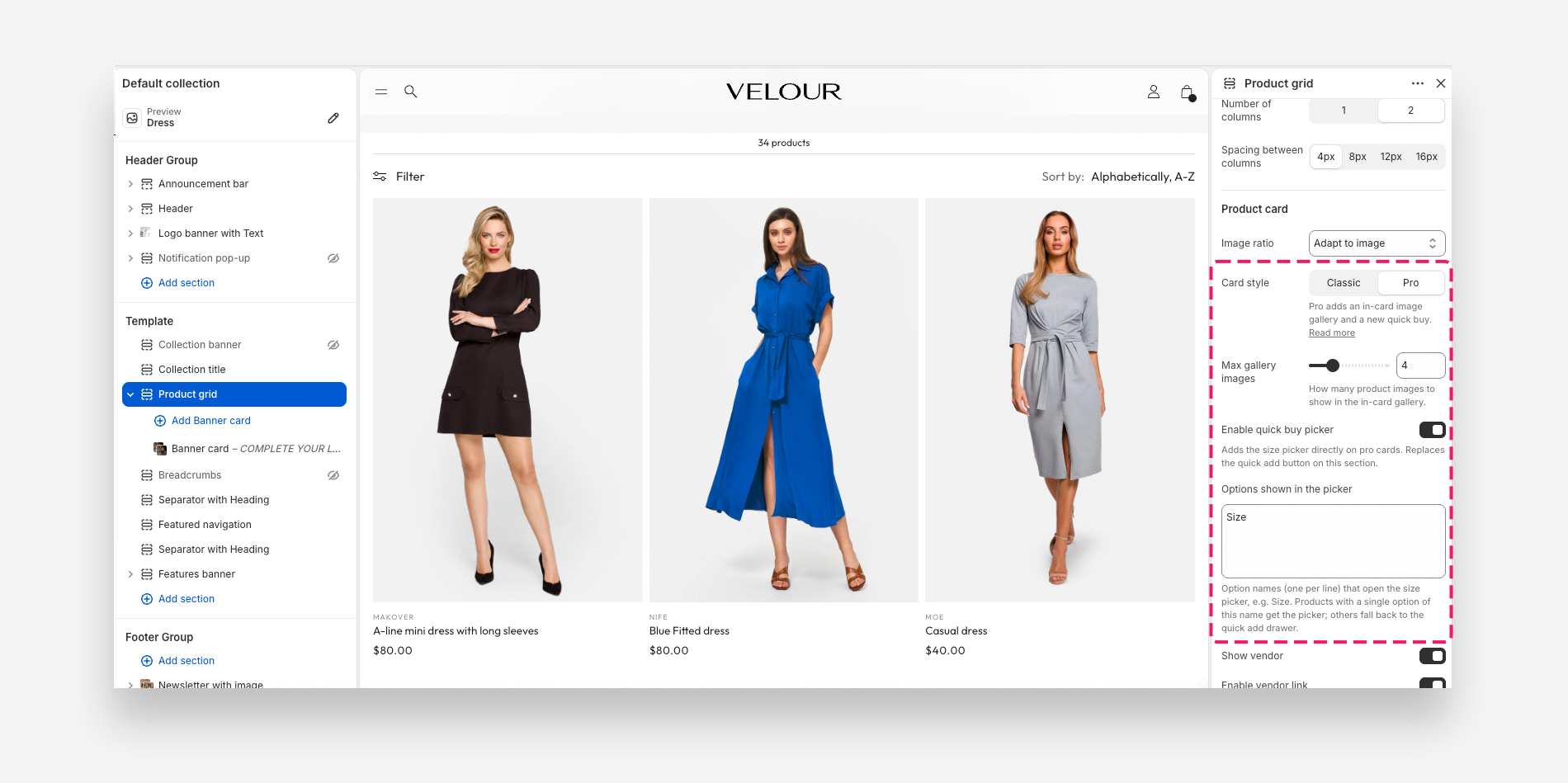
Switching to Pro reveals the Pro-only settings (Max gallery images, quick buy picker) and hides the Classic-only ones (hover image, product video, quick add button).
Product card — Pro style
Shared settings
These apply to both Classic and Pro cards.
| Setting | Options / default | What it does |
|---|---|---|
| Text alignment | Center or Left (default Left) | Aligns the title, price, and rating under the image. |
| Image ratio | Adapt to image, Portrait, or Square (default Square) | The shape of the product image. Adapt to image keeps each product's natural proportions. |
| Show vendor | Varies by section | Displays the product's vendor name. |
| Enable vendor link | Off by default | Makes the vendor name clickable. (Only shown when "Show vendor" is on.) |
| Show product rating | On by default | Displays the product's star rating. Requires a product rating app to be installed. |
| Show review count | On by default | Shows the numeric rating value next to the stars. (Only shown when "Show product rating" is on.) |
| Hide rating if no reviews | Off by default | Hides the rating entirely on products that don't have any reviews yet. (Only shown when "Show product rating" is on.) |
Classic-only settings
These settings disappear when you switch a section to Pro — the Pro gallery and quick buy take over their jobs.
| Setting | Options / default | What it does |
|---|---|---|
| Show second image on hover | Off by default | Reveals the product's second image when customers hover over the card on desktop. |
| Show product media video | Off by default | Plays a Shopify-hosted product video on the card, for products that have one. (Not available in Search results.) |
| Enable quick add button | Off by default | Adds a quick add button to the card so customers can add a product to the cart without opening its page. Recommended for lower-priced, impulse items. |
| Desktop button position | On hover or Below product (default On hover) | Where the quick add button appears on desktop. (Only shown when "Enable quick add button" is on.) |
On Pro cards you don't need the hover-image or video settings: the gallery already shows several images, and any product video is included in the gallery automatically.
Pro-only settings
| Setting | Options / default | What it does |
|---|---|---|
| Max gallery images | 2–10 (default 5) | How many of the product's media items to load into the in-card gallery customers can browse. |
| Enable quick buy picker | Off by default | Adds an inline size picker directly on the card. This replaces the quick add button for this section. |
| Options shown in the picker | Default Size | Option names (one per line) that open the picker — for example Size or Shoe size. Only a product with a single option of this name gets the inline picker; everything else falls back to the quick add drawer. (Only shown when the quick buy picker is on.) |
Size guide popup (Pro quick buy picker)
When the quick buy picker is on, you can attach a size guide that customers open from inside the picker.
| Setting | What it does |
|---|---|
| Link text | The text of the size guide link shown in the picker header. Leave it empty to hide the link. |
| Content | An optional page (title + content) shown in the size guide popup, below the size table. Applies to the Pro card style only. |
| Metafield | A product metafield holding the size table — for example custom.size_chart. Rows are separated by new lines, cells by |, and a leading # marks a header cell. |
The size table format here is the same one used by the Variant Picker block. See How to Set Up a Size Guide per Product for the full metafield format and examples.
When the picker appears — and when it doesn't
With Enable quick buy picker turned on, the button on a Pro card behaves in one of three ways, depending on the product:
| The product has… | What the button does |
|---|---|
| One variant only (or no options at all) | Adds that variant straight to the cart. No picker, no drawer — one click. |
Exactly one option, and its name matches your Options shown in the picker list (for example Size) | Opens the inline picker on the card. Customer taps a value and it's in the cart. |
Two or three options (for example Size + Color, or Size + Color + Material) | Opens the standard quick add drawer, where the customer picks each option in turn. |
One option, but the name doesn't match your list (for example Length when your list only says Size) | Opens the standard quick add drawer. |
Why two-option products use the drawer
The inline picker is a single flat list of values. A product with Size and Color needs the customer to choose a combination, and there's no honest way to show that as one list — picking "M" would be ambiguous when M exists in three colours. Rather than guess, the theme opens the quick add drawer, which shows every option properly.
So on a typical collection page with the picker enabled, you'll see a mix: your single-option products get the fast inline picker, your multi-option products get the drawer. Nothing is ever left without a way to buy, and you don't have to configure anything per product.
If you want every product to use the inline picker, the fix is on the product side, not the theme side: reduce those products to a single option. The usual pattern is Shopify's combined listings — one product per colour, each with only a Size option, linked together with sibling swatches. Then every card gets the inline picker and the colour swatches. See Sibling / variation swatches below.
Inside the picker
- The heading reads Select followed by the product's own option name — so a
Shoe sizeproduct says "Select Shoe size". - Sold-out values still appear, greyed out and labelled Sold out, so customers can see the size exists but isn't in stock right now.
- If you've added a size guide (link text plus a metafield table and/or page), a link appears in the picker header that opens the guide in a popup.
Colors and spacing
Every section that hosts the product card also has its own Colors (text and background) and Section spacing (top/bottom distance, plus optional separate mobile spacing) settings. These affect the whole section, not the individual cards — set them in the same panel.
How it works
Classic vs Pro at a glance
- Classic shows one image per card, swaps to a second image on hover (if enabled), and can offer a quick add button.
- Pro turns that single image into a small gallery — customers can swipe (on mobile) or use the arrows (on desktop) to look through several of the product's images right on the card, up to your Max gallery images limit. Product videos are included in the gallery automatically.
Sibling / variation swatches (combined listings)
If you've enabled product siblings / variations as swatches in your theme settings (Theme settings > Color swatch), Pro cards can show swatches that switch between related products — Shopify's "combined listings" pattern. Selecting a swatch updates the card's image gallery to that sibling's images. This relies on the product-variations metafields configured in theme settings.
Ratings need an app
The Show product rating setting only displays stars if you have a product rating app installed that Wonder supports. Without one, there's no rating data to show. See which review apps work with Wonder.
Tips
- The picker is for one-option products. Before you enable it, look at your catalogue: if most products have
Size+Color, most cards will open the drawer anyway and the picker buys you little. If most have onlySize, it's a big win. - Match the card style to the section's job. Use Pro cards where discovery matters — your main collection page or a hero Featured collection — and Classic cards for compact rows like Recently viewed.
- Keep the gallery lean. More gallery images mean more to load. Five is a good default; raise the Max gallery images limit only if the extra angles really help customers decide.
- The quick buy picker replaces quick add. On a Pro section, turning on the quick buy picker removes the quick add button for that section — so choose one shopping shortcut per section rather than expecting both.
- Name your picker options exactly. The Options shown in the picker list is matched against your product option names, ignoring capitalisation and surrounding spaces. If your products use
Shoe sizerather thanSize, add that as its own line — otherwise those products fall back to the drawer. - Set up siblings once. Sibling swatches are driven by theme-level metafields configured in Theme settings > Color swatch. Configure them once and every Pro section can use them.