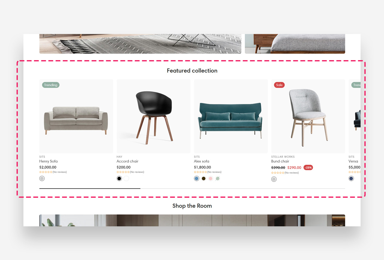
Featured Collection
What is the Featured Collection section?
Since v1.0.0
The Featured Collection section displays products from a selected collection in a clean, organized grid layout. It is ideal for highlighting bestsellers, new arrivals, or any curated product selection directly on the home page or landing pages.
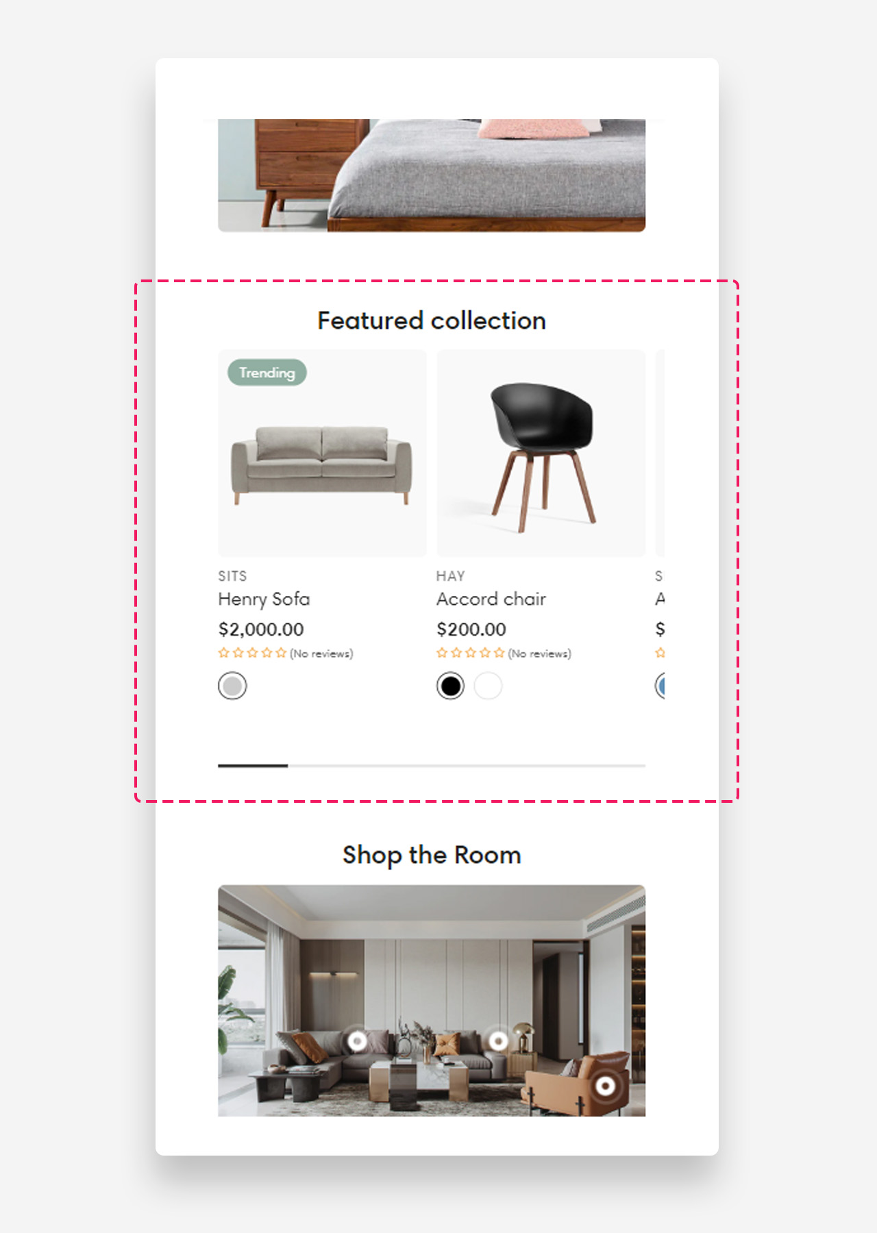
Mobile view example
Main Settings
General
- Heading: Set the title displayed above the product grid. Optionally enable the rich text field to access text formatting options.
- Disable on mobile: Hide the entire section on mobile devices.
- Hide section when no products: When enabled, the section is only visible on the live site when products are available in the selected collection.
- Collection: Select the collection whose products will be displayed in this section.
- Products: Manually select specific products to display. Click Show more to see additional products or Change to replace the selected collection.
- Maximum products to show: Define the maximum number of products displayed in the section.
- Enable stack products: Enable stacking behavior for product cards within the section.
- Enable "View all" if collection has more products than shown: Display a "View all" button when the collection contains more products than the current display limit.
- "View all" style: Choose the visual style of the "View all" button.
Large Screen Version
- Products per row on desktop: Define how many product columns are displayed on desktop.
- Spacing between products on desktop: Define the gap between product cards on desktop — 8px, 16px, or 24px.
- Make products full width: Enable this toggle to stretch product cards to full width on desktop.
Mobile Version
- Products per row on mobile: Define how many product columns are displayed on mobile.
- Spacing between columns on mobile: Define the gap between product cards on mobile — 4px, 8px, 12px, or 16px.
Product Card
- Text alignment: Set the alignment of product text — Center or Left.
- Image ratio: Define the aspect ratio of product images.
- Show product media video: Enable to display video for products with Shopify-hosted videos.
- Show second image on hover: Display an alternate product image when a customer hovers over the product card.
- Show vendor: Display the product vendor name on each product card.
- Enable vendor link: Make the vendor name a clickable link.
- Show product rating: Display the product rating on each card. Requires a product rating app to be installed.
- Enable quick add button: Display a quick add-to-cart button directly on the product card. Recommended for lower-priced items to facilitate quick shopping.
- Desktop button position: Choose where the quick add button appears on desktop — Below product or On hover.
Colors
- Text color: Define the global text color for the section.
- Background color: Customize the background color of the entire section.
Section Spacing
- Top distance: Adjust the spacing above the section.
- Bottom distance: Adjust the spacing below the section.