Newsletter with image
What is the Newsletter with image section?
Since v1.0.0
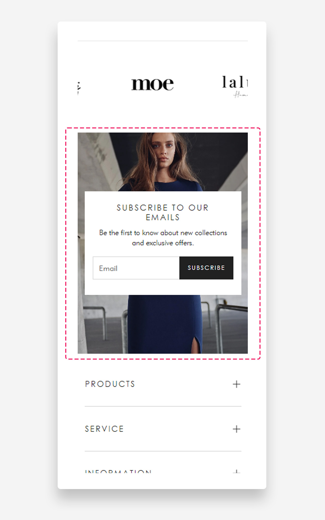
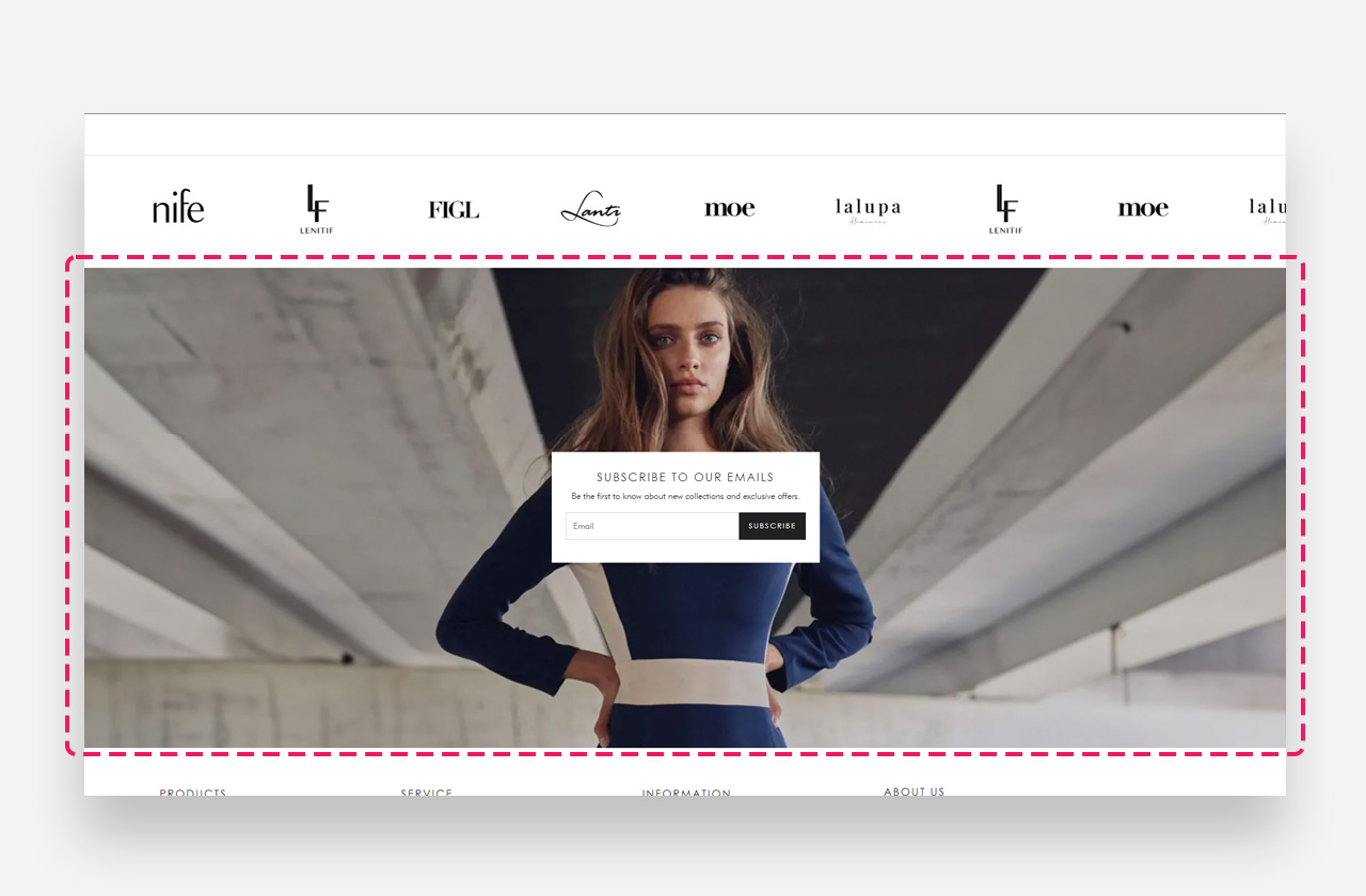
The "Newsletter with image" section is a visually engaging element designed to grow your subscriber base. Featuring a customizable form to subscribe to your newsletter, it allows you to set a custom heading, text, and button. With the option to add a background image and personalize the color of the text container and text, this section seamlessly integrates with your store's aesthetic while encouraging visitor engagement.
Main settings
Section Height
- Height — Choose between two display modes:
- Adapt to image — The section height adjusts automatically based on the image's natural dimensions.
- Fixed height — Forces a consistent height regardless of the image size.
- Desktop fixed height — Set the section height in pixels for desktop devices. Applied only when "Fixed Height" is selected.
- Mobile fixed height — Set the section height in pixels for mobile devices. Applied only when "Fixed Height" is selected.
Large Screen Version
- Image — Upload or select an image to display on desktop and large screen devices. Use the Select button to choose from your library or click Explore free images to browse free stock photos.
Mobile Version
- Image — Upload or select a separate image optimized for mobile devices. Use the Select button to choose from your library or click Explore free images to browse free stock photos.
Colors
- Text color — Define the text color for the section content.
- Text container color — Set the background color of the container behind the text.
- Background Opacity — Adjust the opacity level of the newsletter block's background color. Ranges from 0 (fully transparent) to 100 (fully opaque).
- Background Blur — Apply a blur effect to the background of the newsletter block's header. Value is set in pixels.
Section Spacing
- Distance from the top — Adjust the spacing above the section.
- Distance from the bottom — Adjust the spacing below the section.
- Show custom mobile spacing — Enable this toggle to define separate spacing values for mobile devices, independent from the desktop settings.
- Distance from the top mobile — Adjust the spacing above the section on mobile devices.
- Distance from the bottom mobile — Adjust the spacing below the section on mobile devices.
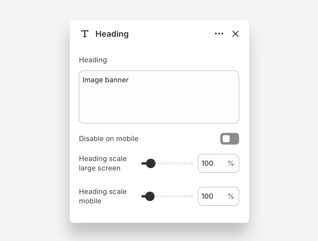
Heading Block
- Heading: Enter the heading text displayed on the banner.
- Disable on mobile: Hide this heading block on mobile devices.
- Heading scale large screen: Adjust the font size of the heading on large screens.
- Heading scale mobile: Adjust the font size of the heading on mobile devices.
Customize subheading block
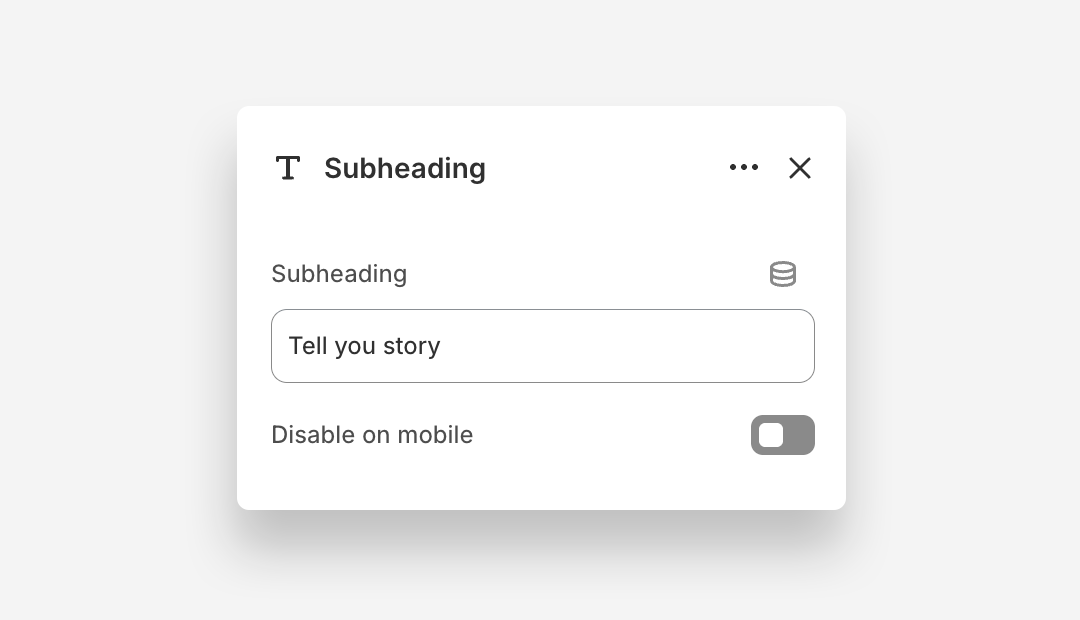
Subheading Block
- Subheading: Enter the subheading text.
- Disable on mobile: Hide this subheading block on mobile devices.
Email Form Block
The Email Form block adds a newsletter signup form to the Newsletter with Image section, allowing customers to subscribe directly from the banner.
- Style: Choose the visual style of the form — Primary or Secondary.
- Button label: Set the text displayed on the form submission button.
Consent Checkbox
- Show consent checkbox: Enable this toggle to display a consent checkbox that customers must check before submitting the form.
- Consent checkbox label: Enter the text displayed next to the consent checkbox. Rich text formatting options are available.
- Validation message: Set the message displayed when a customer attempts to submit the form without checking the consent checkbox.
Mobile view example