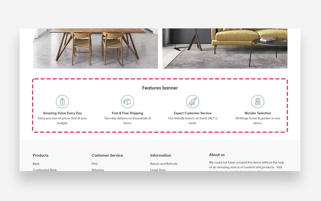
Features banner
What is the Features banner section?
Since v1.0.0
The "Features Banner" section displays key benefits or offerings in a neat, icon-driven format. Tailor the scale for various screens and adjust colors to match your brand. Perfect for a quick, visual rundown of your store's unique selling points.
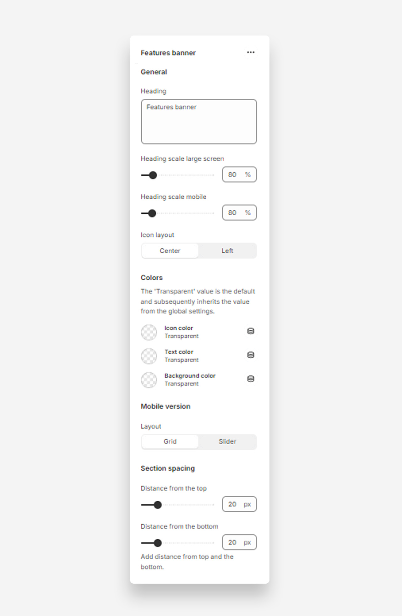
Main settings
Heading
- Heading: Set the title for the features banner to highlight key aspects of your site or products.
Heading Scale
- Heading scale large screen: Adjust the size of the heading for large screens .
- Heading scale mobile: Adjust the size of the heading for mobile screens.
Icon Layout
- Icon layout: Choose the alignment of icons within the banner (options: Center, Left).
Colors
- Icon color: Set the color of the icons. Defaults to the value set in global settings.
- Text color: Set the text color for the section. Defaults to the value set in global settings.
- Background color: Set the background color for the section. Defaults to the value set in global settings.
Mobile Version
Layout
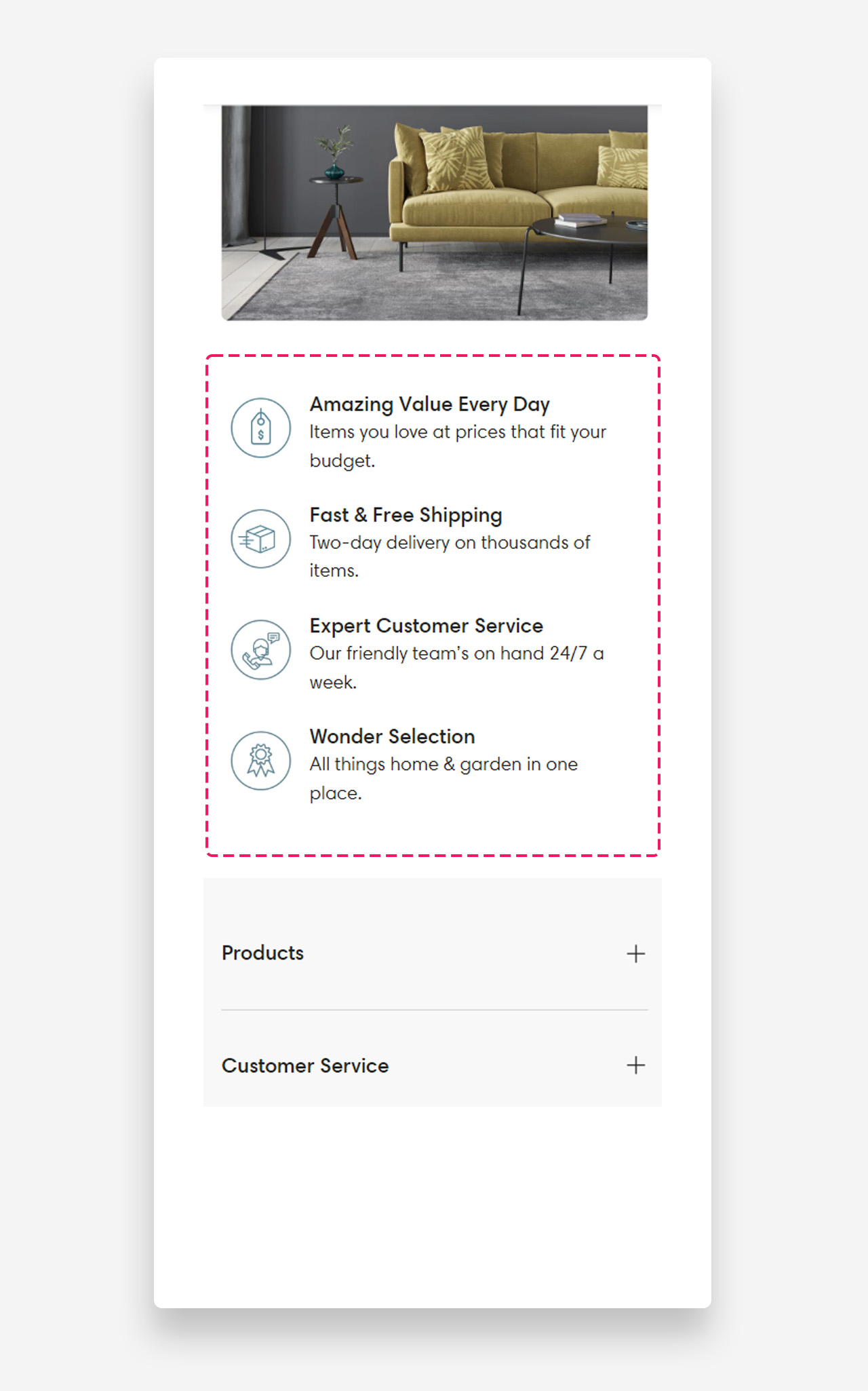
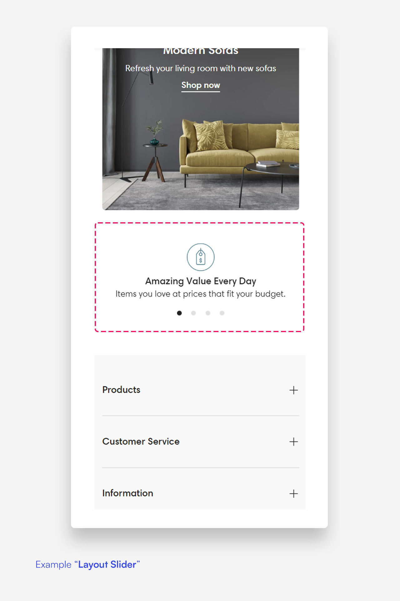
- Layout: Select the layout for the mobile version of the features banner (options: Grid, Slider).
Section Spacing
- Distance from the top: Adjust the spacing from the top of the section.
- Distance from the bottom: Adjust the spacing from the bottom of the section).
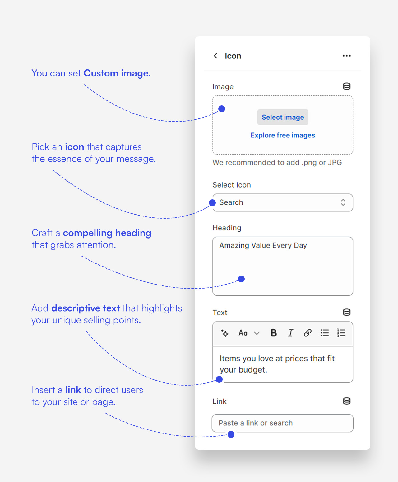
Customize icon blocks
Click one of the preloaded icon blocks to customize it.
Mobile view example