How to Display Product Variants at your product page: Variant Picker vs. Product Siblings
Wonder Theme offers two distinct ways to handle product variations on your Shopify store: the Variant picker block (Shopify's native variant solution) and the Product siblings/variations block — which is a custom Wonder Theme feature. Both blocks can display color/image swatches, which is where the confusion usually starts. This guide explains what each block actually is, how their swatch settings differ, and which one to use.
Naming note: In the theme editor, this custom block is added as "Product siblings" (you'll also see it referred to as "Product variations" or "Combined listings" in the block's description). This guide uses "Product siblings block" to match the admin UI.
Standard Variant Picker (Shopify Native Variants)
The Variant picker block is Shopify's built-in solution for product options. It lets customers select variants (like color or size) from a single product's page, using Shopify's native variant system. All options live on one product.
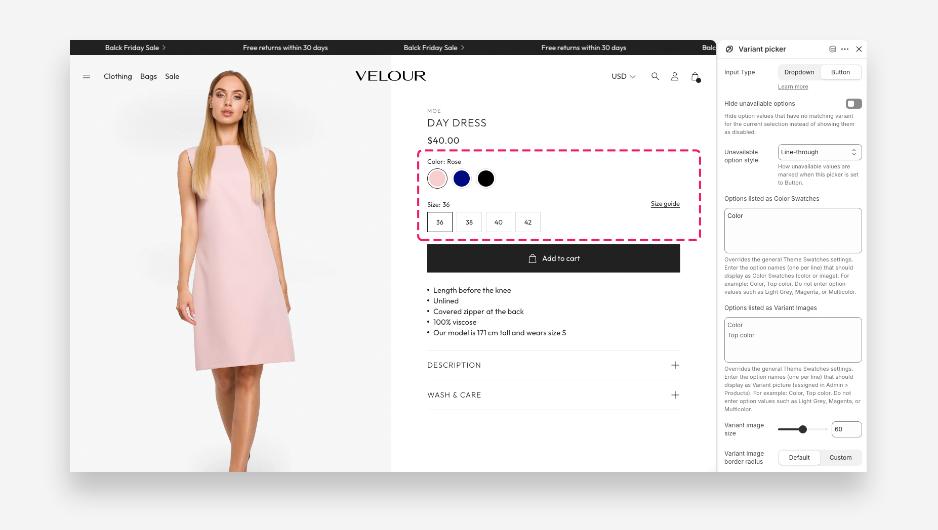
- Native Shopify solution: Uses Shopify's own variant/option data — no extra apps, metafields, or metaobjects needed.
- All options in one product: Combines every product option (e.g. color, size, style) as variants of a single product. Customers see one product page and choose options there.
- Input Type setting is Dropdown or Button — not "Swatch": In the block's settings, Input Type only offers Dropdown and Button. There is no separate "Swatch" input type on this block.
- Swatches appear automatically, based on option name: Swatch display isn't a mode you pick — it's triggered by listing the option name (e.g. "Color") in one of two settings:
- Options listed as Color Swatches — the named option renders as color swatches instead of a dropdown/button list.
- Options listed as Variant Images — the named option renders using each variant's own product image instead of a color swatch. These two settings on the block override the theme-wide defaults of the same name, found under Theme settings > Color Swatch.
- No metafields or metaobjects required: The swatch color/image comes from one of, in priority order:
- Shopify's native per-option-value swatch (set in Products > [product] > Options, using Shopify's built-in color/image picker).
- The variant's assigned product image (for "Variant Images" mode).
- The theme's own Custom colors list (Theme settings > Color Swatch > Custom colors), a plain-text mapping like
Color Name:#HEXorColor Name:image.png.
- Best for simple setups: Ideal when your variations are straightforward (colors, sizes, etc.) and share the same description, images, and page.
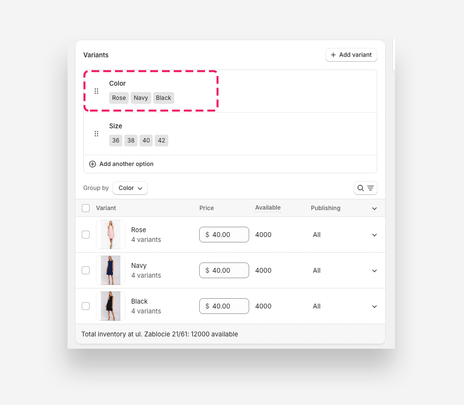
For a full settings reference, see the Variant picker block documentation.
Product Siblings Block ("Product Variations" — Wonder Theme Feature)
The Product siblings block is a custom Wonder Theme feature that lets you display separate, standalone products as selectable variant-style options on a single product page. Instead of one product with many Shopify variants, you link multiple independent products together; picking an option navigates to that linked product.
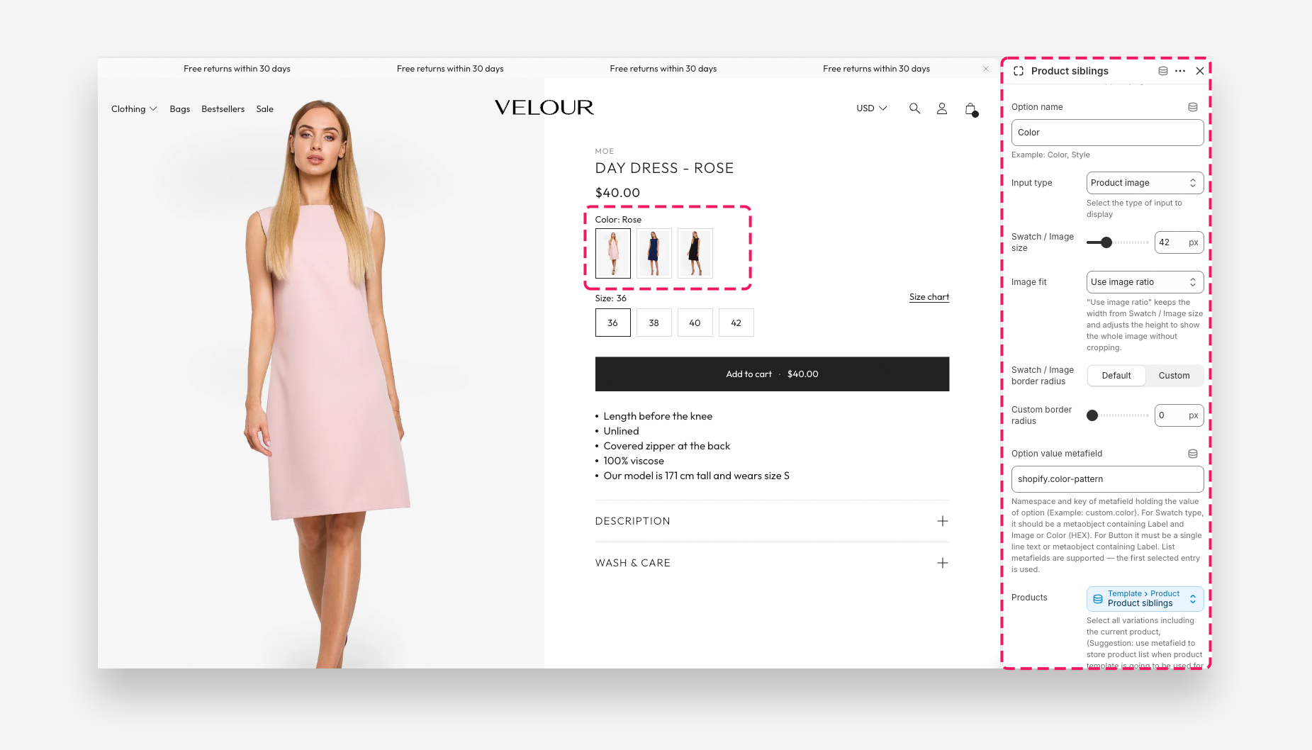
- Custom Wonder Theme block, not native Shopify functionality. Add it to the product page in the theme editor as "Product siblings."
- Combines separate products into one view: You manually choose the linked products via the block's Products setting (a product-list picker) — select the current product plus every sibling you want shown as an option.
- Input Type genuinely includes a Swatch option: Unlike the Variant picker block, this block's Input type setting is a real three-way choice: Product image, Button, or Swatch / Image. This is the block where "swatch" is a mode you explicitly pick, not a side effect of an option name.
- Requires one metafield/metaobject per option value: The Option value metafield setting (e.g.
custom.color) points to the field that supplies each linked product's label/appearance:- For Swatch / Image input type, this should be a metaobject with a Label plus an Image or Color (HEX) field.
- For Button input type, a single-line text field (or a metaobject with a Label) is enough.
- List metafields are supported.
- Rich customization per variation: Because each option is a fully separate product, each one can have its own images, description, media, price, inventory, and URL/SEO — something the native Variant picker can't do per option.
- Ideal for complex or highly differentiated product lines: Best when variations need distinct content or should be managed as separate products in admin, but shoppers should still experience them as one page with swatch-style switching.
Example of the setup in admin
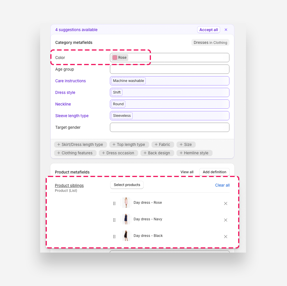
For a full step-by-step walkthrough, see How to Set Up a Product Siblings (Product Variations) Block in Product Page.
The collection/card version of this feature
Product cards (in collections, search, related products, etc.) can also show sibling products as swatches, but they use a separate, theme-wide settings panel under Theme settings > Color Swatch > Product siblings / variations (since cards have no per-product block to configure manually):
- Enable product siblings / variations as swatches — the on/off switch for this behavior on cards.
- Input type — Product image or Swatch / Image (no "Button" option at this level).
- Option value metafield — same metaobject/text requirement as the PDP block.
- Products metafield — Namespace and key of metafield holding product variations. Example: custom.product_variations.
If both Enable product siblings / variations as swatches and Enable color swatch are turned on, product siblings take priority on cards — the two are mutually exclusive, not combined.
Where "Swatch" Means Different Things
The word "swatch" shows up in both features, but it isn't the same setting:
| Variant picker block | Product siblings block | |
|---|---|---|
| Is "Swatch" a selectable Input Type? | No — Input Type is Dropdown or Button only | Yes — Input type includes Swatch / Image |
| What turns swatches on | Listing the option's name under "Options listed as Color Swatches" / "Options listed as Variant Images" | Choosing "Swatch / Image" directly in Input type |
| Where the swatch color/image comes from | Shopify's native option-value swatch, the variant's image, or the theme's Custom colors text list | An Option value metafield — typically a metaobject with Label + Image/Color |
| Metafield/metaobject required? | No | Yes, for the option value; the product list itself is set manually on this block (a metafield is only required for the collection/card version) |
Comparison Table
| Aspect | Variant Picker (Shopify Native) | Product Siblings (Wonder Theme) |
|---|---|---|
| Underlying Structure | All variants belong to one product | Variations are separate products, linked via a manually chosen product list |
| Input Type options | Dropdown, Button (swatches are an automatic override, not a listed option) | Product image, Button, Swatch / Image (swatch is a real, selectable option) |
| Setup Complexity | Easy: create variants in Shopify admin; swatch color comes from Shopify's native option swatch or the theme's Custom colors list — no metafields needed | Advanced: requires choosing the linked products and configuring an Option value metafield (usually a metaobject with Label + Image/Color) |
| Catalog Organization | One product handle covers all variants | Multiple product handles/URLs merged into one shopper-facing view; each still exists separately in collections |
| Content per Variation | Shared: same description/page for all variants, aside from variant image and SKU | Unique: each linked product keeps its own images, description, title, URL, and SEO |
| Card/Collection Equivalent | Controlled by Theme settings > Color Swatch > Enable color swatch | Controlled by Theme settings > Color Swatch > Product siblings / variations, which requires a Products metafield and takes priority over the native card swatch setting |
| Use Case Suitability | Basic variations (size, color) sharing one description | Complex, richly differentiated product lines needing their own content per option |
When to Use Each Approach
Use the Variant picker block if: your product variations are simple options that don't need separate content — for example, sizes or colors on the same T‑shirt. Turn on swatches by listing the option name under "Options listed as Color Swatches" or "Options listed as Variant Images"; no metafield setup is required.
Use the Product siblings block if: each variation is genuinely its own product, or needs its own images, description, or URL. You'll need to pick the linked products manually on the block and set up an Option value metafield (typically a metaobject with Label + Image/Color) so the Swatch / Image, Button, or Product image display works correctly.
Conclusion
Both blocks can show swatches on your product pages, but "swatch" means something different in each: on the Variant picker, it's an automatic style triggered by an option's name and needs no metafield; on the Product siblings block, it's an explicit Input Type that depends on an Option value metafield pointing to a metaobject. Choose the Variant picker for simple, single-product variations, and Product siblings when your variations are genuinely separate products that need richer, independent content.