Variant picker block
Variant picker block
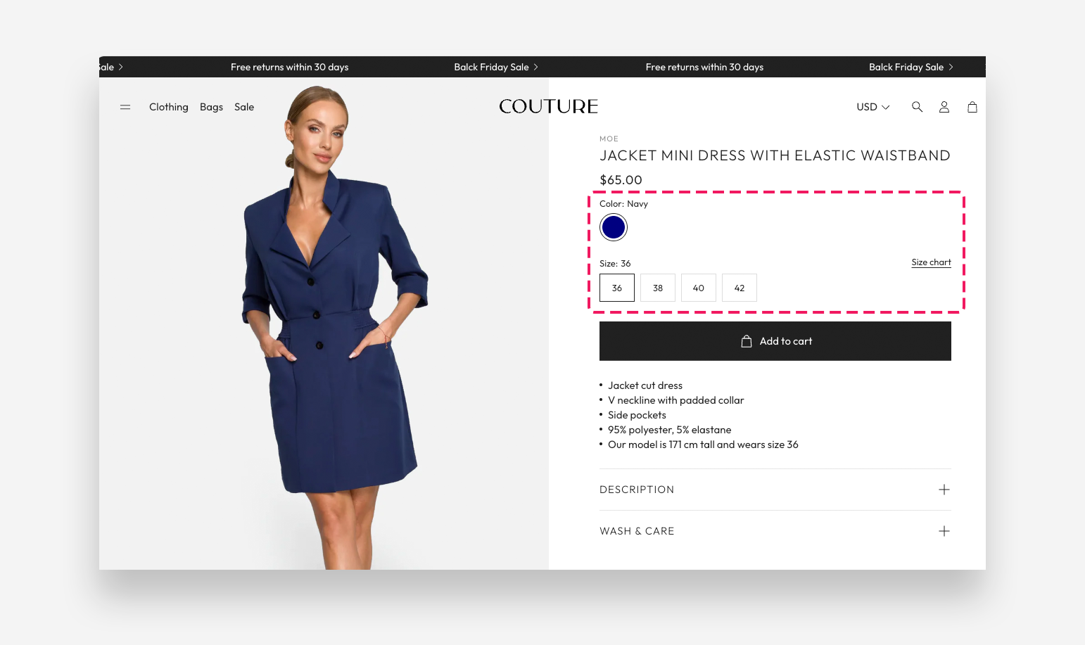
The Variant Picker block displays product option selectors on the product page, allowing customers to choose variants such as color, size, or material. It supports multiple input styles and can display options as color swatches, variant images, or dropdown menus.
Shopify Category Metafields Shopify provides native color swatches via category metafields. When defined, the theme automatically uses these values for swatch display. See the Shopify Category Metafields guide for setup instructions.
Settings
For a complete walkthrough of all customization options, see: A Complete Guide to Customizing the Variant Picker.
- Input Type: Choose the default style for option selectors — Dropdown or Button.
- Hide unavailable options: Enable this toggle to hide option values that have no matching variant for the current selection, instead of showing them as disabled.
- Unavailable option style: Choose how unavailable values are marked when the picker is set to Button — for example Line-through.
Options Listed as Color Swatches
- Options listed as Color Swatches: Enter the option names (one per line) that should display as color swatches — for example Color. This overrides the general Theme Swatches settings. Do not enter option values such as Light Grey, Magenta, or Multicolor.
Options Listed as Variant Images
- Options listed as Variant Images: Enter the option names (one per line) that should display as variant images assigned in Admin > Products — for example Color or Top color. This overrides the general Theme Swatches settings. Do not enter option values such as Light Grey, Magenta, or Multicolor.
- Variant image size: Set the size of the variant image swatches.
- Variant image border radius: Choose the border radius style for variant image swatches — Default or Custom.
- Custom border radius: Set a custom border radius value for the variant image swatches. Applied only when Custom border radius is selected.
Options Listed as Dropdown
- Options listed as dropdown: Enter the option names (one per line) that should display as a dropdown selector — for example Color or Top color.
Block Spacing
- Distance from the top: Adjust the spacing above the variant picker block.
- Distance from the bottom: Adjust the spacing below the variant picker block.
Size Guide Popup
These settings are dedicated to use with the size table popup.
- Icon: Choose a built-in icon displayed as the size guide trigger.
- Link text: Enter the label displayed next to the icon that opens the size guide popup — for example Size chart.
- Variant name: Enter the variant option name for assigning the size guide to display in the proper row — for example size.
- Content: Select a Shopify page to use as the source of the popup content. You can add text, tables, or images to the selected page.
- Metafield: Enter the metafield namespace and key to retrieve a size chart table, using the format namespace.key — for example custom.size_chart. The metafield type should be multi-line text.
- Enable striped rows table layout: Enable this toggle to apply alternating row colors to the size chart table. When enabled, odd rows will have a grey background.
The Variant Picker block includes a built-in size guide popup that appears next to a specific variant option (typically "Size"). You can display a size chart sourced from a product metafield (different per product) or from a Shopify page (shared across products).
For a step-by-step setup, see: How to Set Up a Size Guide per Product.
Learn more about the differences between Standard Variant Picker and Product Variations in our detailed comparison guide.