Banner card
Banner Card Block
Since v2.1.0
Banner Card is a special element that allows you to place a highlighted banner directly within the product grid on a collection page. Instead of a regular product card, a banner appears in a selected position within the grid - perfect for promotions, marketing messages, or highlighting key offers without disrupting the collection layout.
How to set up Banner Card block?
- Go to the collection template and select the Product grid section.
- Add a Card Banner block.
- Add a text and/or a button to display on the banner.
- Select the banner position - for example, “Position before nth product: 5” means the card banner will appear before the 5th product in the grid.
- Choose the image width to span one or two columns , separately for large and mobile screens.
- Add an image and adjust the text size and text position for both large and mobile screens
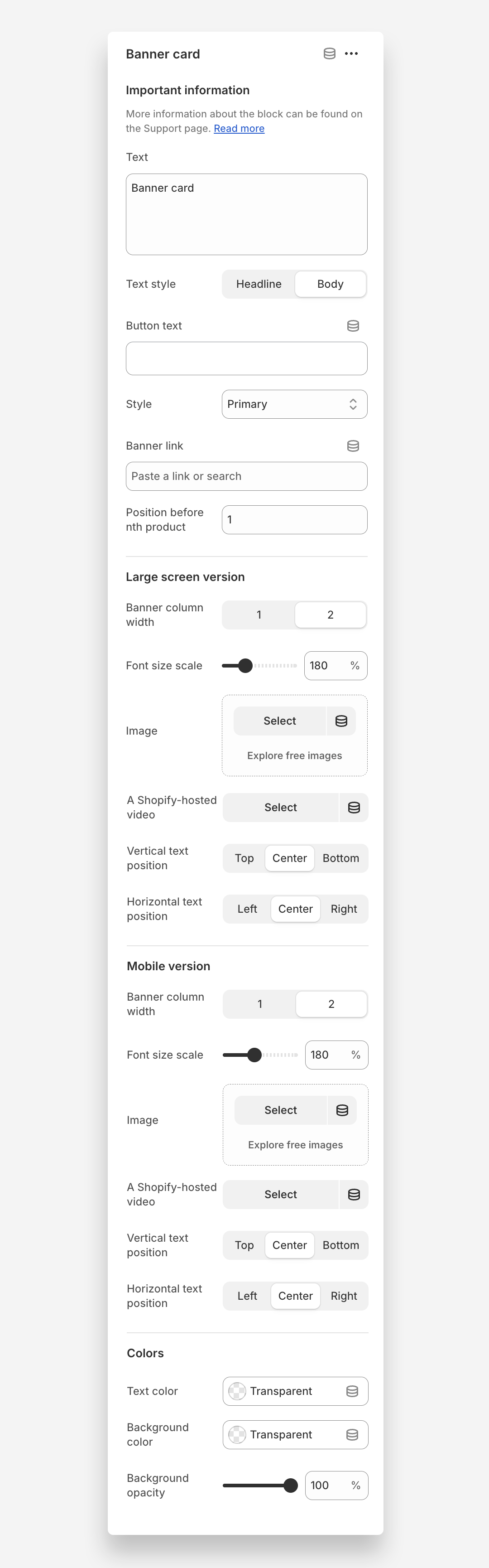
Main settings
General
- Text: Add main text content displayed on the card banner.
- Text style: Choose the visual style of the banner text (headline or body)
- Button text: Add text displayed inside the banner button.
- Style: Choose button style (primary, secondary or underline link)
- Banner link: Add a URL to redirect users when the banner card is clicked.
- Position before nth product: Defines where the card banner appears in the product grid.For example, setting 5 places the banner before the 5th product .
Large screen version
- Banner column width: Choose whether the banner spans one or two columns on desktop.
- Font size scale: Adjust the text size for large screens.
- Image: Image displayed inside the banner on desktop.
- A Shopify-hosted video: Optional video to display instead of an image on desktop. Note: adding a video will override the image, so the video will be shown instead.
- Vertical text position: Set the vertical alignment of text inside the banner on desktop ( top , center , or bottom )
- Horizontal text position: Set the alignment of text within the banner on desktop ( left, center , or right).
Mobile version
- Banner column width: Choose whether the banner spans one or two columns on mobile devices.
- Font size scale: Adjust the text size for mobile screens.
- Image: Image displayed inside the banner on mobile.
- A Shopify-hosted video: Optional video to display instead of an image on mobile. Note: adding a video will override the image, so the video will be shown instead.
- Vertical text position: Set the vertical alignment of text inside the banner on mobile ( top , center , or bottom )
- Horizontal text position: Set the alignment of text within the banner on mobile ( left, center , or right).
Colors
- Text color: Choose the color of the text displayed on the banner.
- Background color: Set the background color of the banner overlay
- Background opacity: Adjust the transparency level of the banner background.