Slideshow
What is the Slideshow section?
Since v1.0.0
The "Slideshow" section is a dynamic display feature for your Shopify store, designed to highlight multiple images, promotions, or stories in a rotating carousel. This visually engaging element can effectively capture customer attention and guide them to different parts of your store.
Main settings
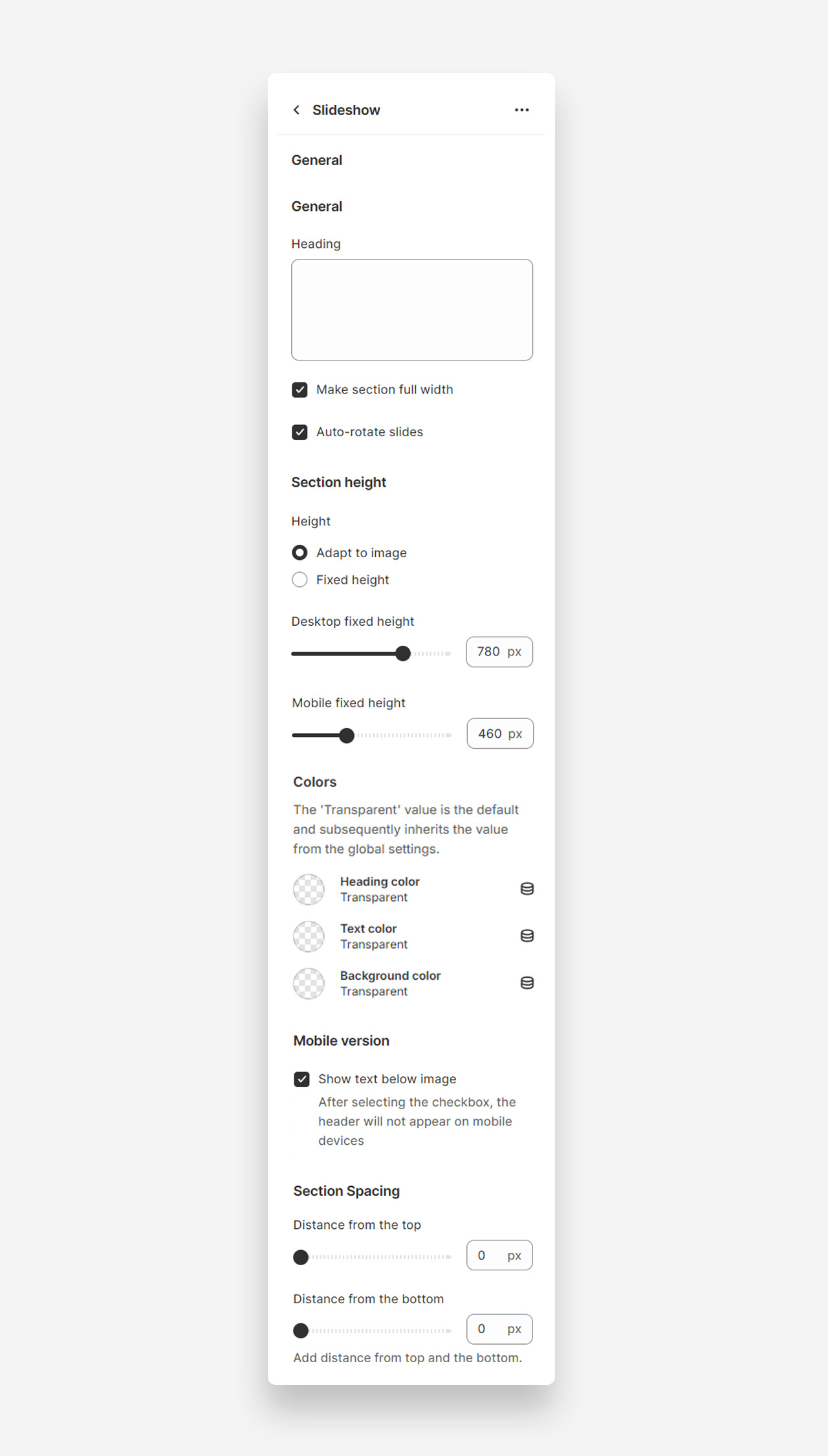
Heading
- Heading: Set the title for the slideshow section to introduce the content.
Make Section Full Width
- Make section full width: Enable this setting to make the slideshow section span the entire width of the container.
Auto-Rotate Slides
- Auto-rotate slides: Enable this setting to allow the slides to automatically rotate.
Section Height
Height
- Height: Choose between adapting the height to the image or setting a fixed height.
- Desktop fixed height: Adjust the fixed height for desktop view (default 780px).
- Mobile fixed height: Adjust the fixed height for mobile view (default 460px).
Colors
- Heading color: Set the color of the section heading. Defaults to the value set in global settings.
- Text color: Set the text color for the section. Defaults to the value set in global settings.
- Background color: Set the background color for the section. Defaults to the value set in global settings.
Mobile Version
Show Text Below Image
- Show text below image: Enable this setting to show the text below the image on mobile devices.
Section Spacing
- Distance from the top: Adjust the spacing from the top of the section (default 0px).
- Distance from the bottom: Adjust the spacing from the bottom of the section (default 0px).
Customize slide blocks
- Subheading : Craft a brief teaser or slogan that introduces the slide's message.
- Heading : Add a prominent title to your slide that captures attention.
- Text : Include descriptive text that tells more about your brand's story or the featured content.
- Button : Customize up to two buttons with your call-to-action text and links to guide customers to desired actions.
- Heading Scale : Adjust the size of the slide heading for both desktop and mobile screens to ensure its impact.
- Image Selection : Choose a compelling image for both the large screen and mobile versions to best represent the slide's content.
- Text Alignment : Decide on the placement of your text for both desktop and mobile layouts for clear readability.
- Custom Text Color : Define the color of your text to maintain visibility and brand consistency.
- Background Color and Opacity : Set the background color and adjust its opacity to enhance the slide's visual appeal.
- Mobile Text Below Image : Opt to show text below the image on mobile devices for a streamlined appearance.