Slide-up Feature Banner
What is the Slide-up Feature Banner section?
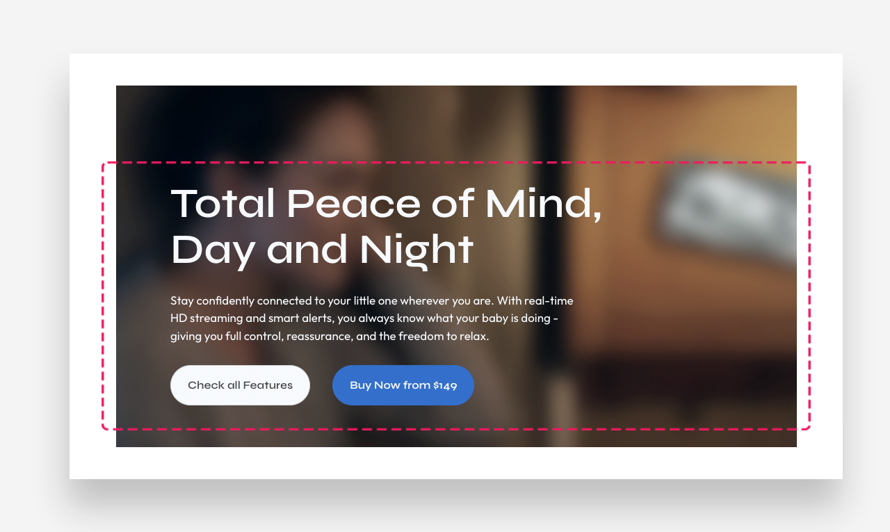
The Slide-up Feature Banner section allows you to create a dynamic full-screen hero banner with layered content. The section is split into two distinct content areas — Top content and Bottom content — which stack vertically to create an immersive scrolling experience with an optional blur effect between them.
Mobile view example
Main settings
General
- Headline: Set the main title for the section using the rich text field, which supports full text formatting options.
- Enable blur effect on bottom content: Activate a blur overlay that appears between the top and bottom content areas as the user scrolls.
Large Screen Version
- A Shopify-hosted video: Select a video to display as the banner background on desktop.
- Image: Upload a background image displayed on large screens.
Mobile Version
- A Shopify-hosted video: Select a video to display as the banner background on mobile devices.
- Image: Upload a background image displayed on mobile devices.
Colors
- Text color: Define the global text color for the section.
- Blur overlay color: Set the color of the blur overlay that activates when the Bottom content block appears on screen.
- Blur overlay opacity: Adjust the opacity level of the blur overlay.
Section Spacing
- Distance from the top: Adjust the spacing above the section.
- Distance from the bottom: Adjust the spacing below the section.
Optimization
- High-priority image loading: Enable this option to load the banner image with high priority, improving perceived page load speed.
Top Content block
The Top Content block contains the primary foreground elements displayed over the banner background. Use the Add Block button to add content elements to this area.
Settings
- Make section full width: Enable this toggle to stretch the content area to the full width of the screen.
Large Screen Version
- Enable sticky content: Keep the top content fixed in place on desktop as the user scrolls.
- Large screen text alignment: Set the vertical alignment of the content on desktop — Top, Center, or Bottom.
- Horizontal alignment: Set the horizontal alignment of the content on desktop — Left, Center, or Right.
Mobile Version
- Enable sticky content: Keep the top content fixed in place on mobile as the user scrolls.
- Mobile screen text alignment: Set the vertical alignment of the content on mobile — Top, Center, or Bottom.
- Horizontal alignment: Set the horizontal alignment of the content on mobile — Left, Center, or Right.
Colors
- Text color: Define the text color for the Top content block.
Section Spacing
- Distance from the top: Adjust the spacing above the Top content block.
- Distance from the bottom: Adjust the spacing below the Top content block.
Heading block
The Heading block displays the main headline within the Top content area.
- Heading: Enter the heading text.
- Heading alignment (large screen): Set the text alignment on desktop.
- Heading scale large screen: Adjust the font size of the heading on large screens.
- Max width: Define the maximum width of the heading container on desktop. Setting the value to 0 means no max width.
- Heading alignment (mobile): Set the text alignment on mobile devices.
- Heading scale mobile: Adjust the font size of the heading on mobile devices.
- Disable on mobile: Hide this heading block on mobile devices.
Text block
The Text block displays supporting body copy beneath the heading within the Top content area.
- Text: Enter the body text. Rich text formatting options are available.
- Text alignment (large screen): Set the text alignment on desktop.
- Max width: Define the maximum width of the text container on desktop. Setting the value to 0 means no max width.
- Text alignment (mobile): Set the text alignment on mobile devices.
- Disable on mobile: Hide this text block on mobile devices.
Block Spacing
- Distance from the top: Adjust the spacing above the text block.
- Distance from the bottom: Adjust the spacing below the text block.
Button block
The Button block adds one or two call-to-action buttons to the Top content area.
- Enable full width on mobile devices: Stretch the button to full width on mobile.
Button 1
- Style: Choose the visual style of the button.
- Text: Set the button label.
- Disable on mobile: Hide Button 1 on mobile devices.
- Link: Assign a URL or page link to the button.
- Open link as a new window: Enable to open the linked page in a new browser tab.
Button 2
- Style: Choose the visual style of the button.
- Text: Set the button label.
- Disable on mobile: Hide Button 2 on mobile devices.
- Link: Assign a URL or page link to the button.
- Open link as a new window: Enable to open the linked page in a new browser tab.
How to set up Top Content block
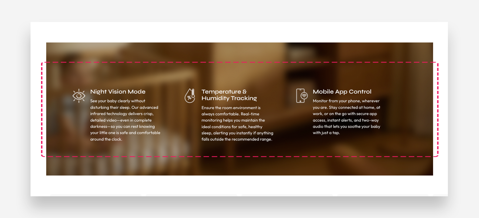
Bottom Content block
The Bottom content block is the secondary content area that slides up over the banner background, creating a layered visual effect. Use the Add Block button to add content elements to this area.
Settings
- Make section full width: Enable this toggle to stretch the bottom content area to the full width of the screen.
Large Screen Version
- Large screen text alignment: Set the vertical alignment of the content on desktop — Top, Center, or Bottom.
- Horizontal alignment: Set the horizontal alignment of the content on desktop — Left, Center, or Right.
- Minimum content height: Define the minimum height of the bottom content area on desktop (in vh).
Mobile Version
- Mobile screen text alignment: Set the vertical alignment of the content on mobile — Top, Center, or Bottom.
- Horizontal alignment: Set the horizontal alignment of the content on mobile — Left, Center, or Right.
- Minimum content height: Define the minimum height of the bottom content area on mobile.
Colors
- Text color: Define the text color for the Bottom content block.
Section Spacing
- Distance from the top: Adjust the spacing above the Bottom content block.
- Distance from the bottom: Adjust the spacing below the text block.
How to set up Bottom Content block
Icons Container block
The Icons Container block groups multiple Icon blocks into a structured grid layout within the Bottom content area.
- Enable advanced settings: Activate additional layout configuration options.
Large Screen Version
- Layout: Set the alignment of the icon grid on desktop — Left or Center.
- Columns number: Define how many columns the icon grid displays on desktop.
- Gap: Set the spacing between icon blocks on desktop.
- Icon margin top: Adjust the spacing above each icon.
- Icon margin bottom: Adjust the spacing below each icon.
- Icon width: Define the width of each icon.
- Heading size scale: Adjust the font size of the icon block headings.
Mobile Version
- Layout: Set the alignment of the icon grid on mobile — Left or Center.
- Columns number: Define how many columns the icon grid displays on mobile.
- Gap: Set the spacing between icon blocks on mobile.
- Icon margin top: Adjust the spacing above each icon on mobile.
- Icon margin bottom: Adjust the spacing below each icon on mobile.
- Icon width: Define the width of each icon on mobile.
- Heading size scale: Adjust the font size of the icon block headings on mobile.
Colors
- Icon color: Set the color of the icons.
- Text color: Define the text color within the Icons container.
- Background icon color: Set the background color displayed behind each icon.
Block Spacing
- Distance from the top: Adjust the spacing above the Icons container block.
- Distance from the bottom: Adjust the spacing below the Icons container block.
Icon block
The Icon block represents a single feature entry within the Icons Container. Use the Add Block button to add more icon blocks.
- Image: Upload a custom image to use as the icon. PNG or JPG format is recommended.
- Select Icon: Choose an icon from the built-in icon library.
- Heading: Enter the title for this feature.
- Text: Add a description for this feature. Rich text formatting options are available.
- Link: Assign a URL or page link to this icon block.
How to set up Icons Container block
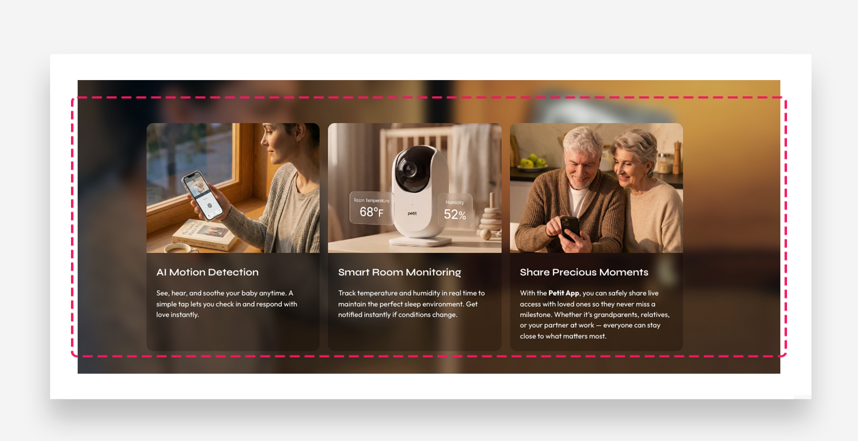
Cards Container block
The Cards Container block allows you to display a grid of visually rich content cards, each combining an image, heading, and descriptive text. It is ideal for showcasing product features, use cases, or any categorized content in a structured and engaging layout.
General
- Image ratio: Define the aspect ratio of the card images.
Large Screen Version
- Columns number: Define how many card columns are displayed on desktop (1, 2, 3, or 4).
- Gap: Set the spacing between cards on desktop (in px).
Tablet Version
- Columns number: Define how many card columns are displayed on tablet (1, 2, 3, or 4).
- Gap: Set the spacing between cards on tablet (in px).
Mobile Version
- Columns number: Define how many card columns are displayed on mobile (1 or 2).
- Gap: Set the spacing between cards on mobile (in px).
Colors
- Text color: Define the global text color for the section.
- Background card color: Set the default background color applied to all cards.
- Background opacity: Adjust the opacity of the card background color (in %).
Block Spacing
- Distance from the top: Adjust the spacing above the Cards container block.
- Distance from the bottom: Adjust the spacing below the Cards container block.
Card block
The Card block represents a single content card within the Cards Container. Use the Add Block button to add more cards.
- Image: Upload an image displayed at the top of the card.
- Heading: Enter the card title. Rich text formatting options are available.
Large Screen Version
- Heading scale large screen: Adjust the font size of the card heading on large screens.
Mobile Version
-
Heading scale mobile: Adjust the font size of the card heading on mobile devices.
-
Text: Add a description displayed below the card heading. Rich text formatting options are available.
Colors
- Background color: Set a custom background color for this individual card.
- Background opacity: Adjust the opacity of this card's background color.
Button 1
- Style: Choose the visual style of the button.
- Text: Set the button label.
- Link: Assign a URL or page link to the button.