Scrolling text banner
What is the Scrolling Text Banner section?
The Scrolling Text Banner section offers a dynamic and visually engaging way to showcase your content. This section features separate images for desktop and mobile, but its standout feature is the scrolling text overlay, which creates a sleek animated effect. You can disable the background image for a minimalist look and focus solely on the text animation. With customizable animation speed and an optional call-to-action button, this section provides versatile options to grab attention and convey your message effectively.
Mobile view Example
Main Settings
General
- Heading: Set the scrolling text displayed across the banner. Optionally enable the rich text field to access text formatting options including bold, italic, links, and heading levels.
- Make section full width: Enable this toggle to stretch the banner to the full width of the screen.
- Animation speed: Control the speed of the scrolling text, where 1 is the slowest and 10 is the fastest.
- Gap: Set the spacing between repeated instances of the scrolling text.
- Enable dot separator: Enable a dot separator displayed between each repetition of the scrolling text.
- Dot size: Set the size of the dot separator — Small, Medium, or Large.
Section Height
- Height: Choose from three display options — Adapt to image, which adjusts the banner height based on the uploaded image; Fixed height, which sets a specific height regardless of the image; or Fixed height and no image, which hides the background image entirely and uses only the fixed height.
- Desktop fixed height: Define the fixed height of the banner on desktop. Applied only when Fixed Height is selected.
- Mobile fixed height: Define the fixed height of the banner on mobile devices. Applied only when Fixed Height is selected.
Large Screen Version
- Image: Upload a background image displayed on large screens.
- Large screen text alignment: Set the vertical alignment of the content on desktop — Top, Center, or Bottom.
- Horizontal alignment: Set the horizontal alignment of the content on desktop — Left, Center, or Right.
Mobile Version
- Image: Upload a background image displayed on mobile devices.
- Mobile screen text alignment: Set the vertical alignment of the content on mobile — Top, Center, or Bottom.
- Horizontal alignment: Set the horizontal alignment of the content on mobile — Left, Center, or Right.
Colors
- Heading color: Set the color of the section heading displayed above the banner.
- Section background color: Customize the background color of the entire section.
- Background opacity: Adjust the opacity of the section background color.
- Text color: Define the color of the scrolling text displayed on the banner.
- Image container color: Set the background color of the image container.
- Background opacity: Adjust the opacity of the image container background color.
Section Spacing
- Distance from the top: Adjust the spacing above the section.
- Distance from the bottom: Adjust the spacing below the section.
Blocks
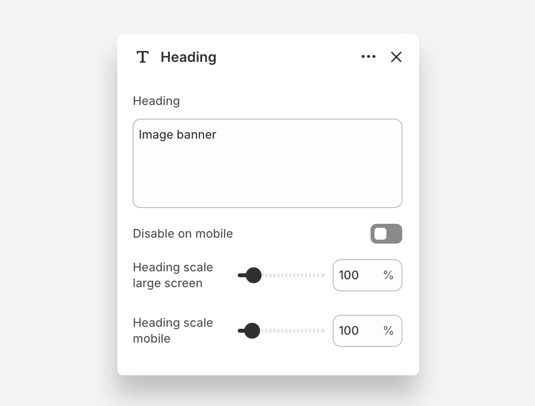
Heading Block
- Heading: Enter the heading text displayed on the banner.
- Disable on mobile: Hide this heading block on mobile devices.
- Heading scale large screen: Adjust the font size of the heading on large screens.
- Heading scale mobile: Adjust the font size of the heading on mobile devices.
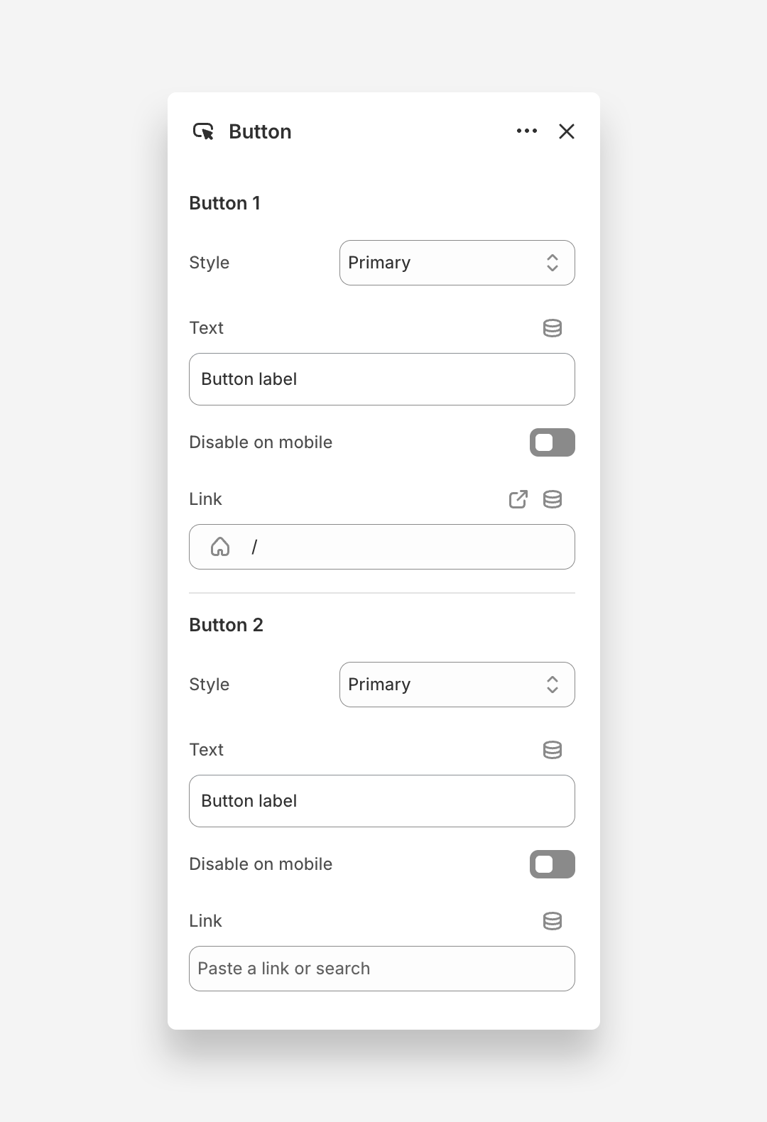
Button Block
The Button block adds one or two call-to-action buttons overlaid on the banner image.
Button 1
- Style: Choose the visual style of the button.
- Text: Set the button label.
- Disable on mobile: Hide Button 1 on mobile devices.
- Link: Assign a URL or page link to the button.
Button 2
- Style: Choose the visual style of the button.
- Text: Set the button label.
- Disable on mobile: Hide Button 2 on mobile devices.
- Link: Assign a URL or page link to the button.
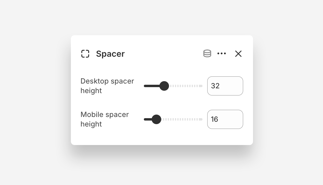
Spacer Block
The Spacer block adds a blank vertical space between content elements within the banner, allowing you to control the layout.
- Desktop spacer height: Define the height of the spacer on desktop.
- Mobile spacer height: Define the height of the spacer on mobile devices.