Image with Video (Image with video for transparent header)
What is the Image with Video section?
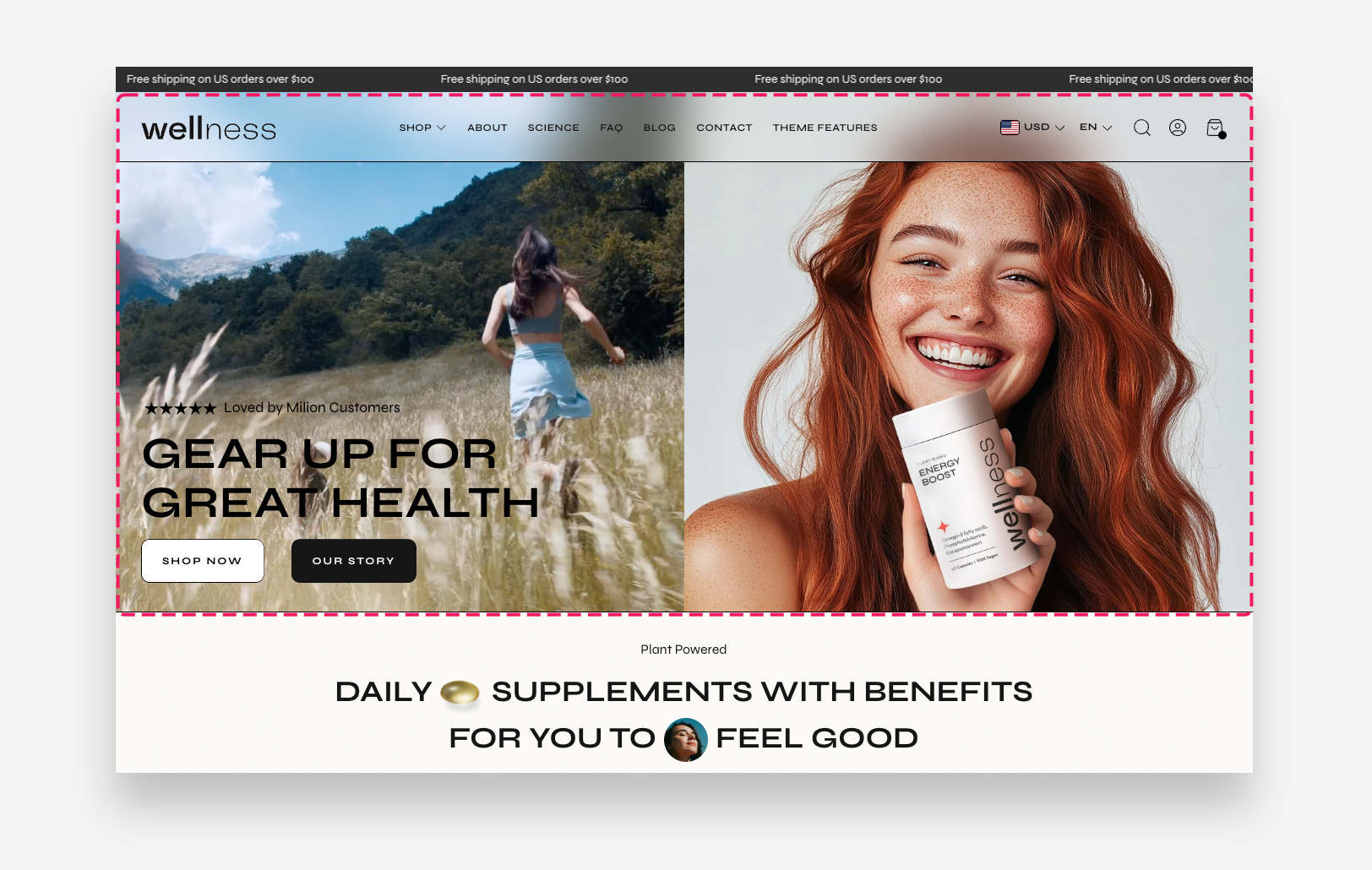
The Image with Video (Home) section is a full-screen hero section that combines a background video or image on the left with a hero image on the right. It supports flexible content blocks including icon with text, heading, subheading, text, button, spacer, and custom Liquid. This section is designed to be used as the first section on the homepage and is required for the Transparent Menu header layout to work correctly.
To display a transparent header over this section, go to the Header settings and set the Layout to Transparent menu or Transparent menu, logo left.
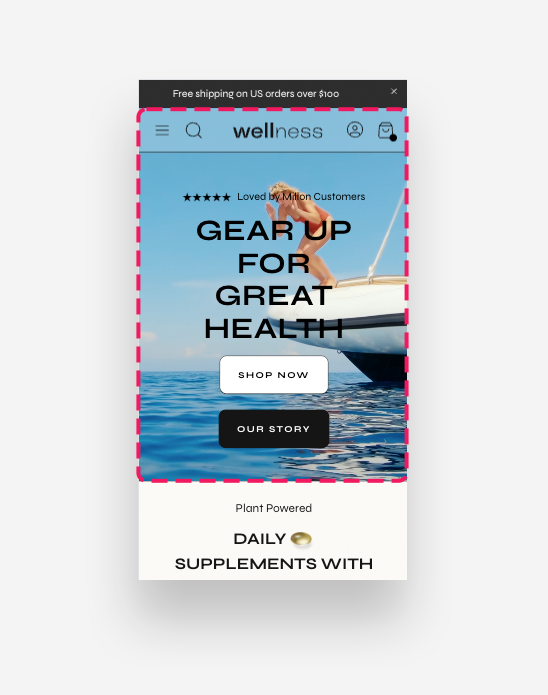
Mobile view example
Main Settings
Content Position
This option works only with Shopify-hosted videos. If you use a YouTube or Vimeo video, you have to select Image.
- Content over: Choose whether the content blocks are placed over the Image or the Video panel.
Section Height
- Height: Choose between Adapt to image, which adjusts the section height based on the image, or Fixed height, which sets a specific height regardless of the media.
- Desktop fixed height: Define the fixed height of the section on desktop. Applied only when Fixed height is selected.
- Mobile fixed height: Define the fixed height of the section on mobile devices. Applied only when Fixed height is selected.
Shopify-hosted Video
Videos play on loop with no sound.
- A Shopify-hosted video for Mobile: Upload or select a video to display as the background on mobile devices.
- A Shopify-hosted video for Desktop: Upload or select a video to display as the background on desktop. When a video is selected, it takes priority over the background image.
- Enable autoplay: Enable this toggle to automatically play the video when the page loads.
- Loop video: Enable this toggle to replay the video continuously.
- Show default video controls: Enable this toggle to display the browser's native video playback controls.
- Show custom play/pause button: Enable this toggle to display a custom play and pause button over the video.
- Show custom unmute/mute button: Enable this toggle to display a custom mute and unmute button over the video.
- Mobile Layout: Choose how the section is displayed on mobile. Options include Show only video, Show only hero, and Show both.
- Layout: Set the order of the video and hero panels. Choose between First video and Hero first.
Colors
- Text color: Define the global text color for the section.
- Text container color: Set the background color of the content container displayed over the video or image panel.
- Background opacity: Adjust the opacity of the text container background color.
Large Screen Version
- Image: Upload the hero image displayed on the right panel on desktop.
- Large screen text alignment: Set the vertical alignment of the content on desktop — Top, Center, or Bottom.
- Horizontal alignment: Set the horizontal alignment of the content on desktop — Left, Center, or Right.
Mobile Version
- Image: Upload the hero image displayed on mobile devices.
- Mobile text alignment: Set the vertical alignment of the content on mobile — Top, Center, or Bottom.
- Horizontal alignment: Set the horizontal alignment of the content on mobile — Left, Center, or Right.
Blocks
Icon with Text
- Image: Upload a custom icon image to display alongside the text.
- Select icon: Choose a built-in icon to display. Used when no custom image is uploaded.
- Horizontal alignment desktop: Set the horizontal alignment of the icon and text on desktop.
- Horizontal alignment mobile: Set the horizontal alignment of the icon and text on mobile devices.
- Align icon to top: Enable this toggle to align the icon to the top of the text instead of centering it vertically.
- More icon settings: Enable this toggle to reveal additional icon sizing and spacing controls.
- Icon scale desktop: Set the size of the icon on desktop.
- Icon scale mobile: Set the size of the icon on mobile devices.
- Icon top margin desktop: Set the top margin of the icon on desktop.
- Icon top margin mobile: Set the top margin of the icon on mobile devices.
- Text: Enter the text displayed alongside the icon.
- Text scale large screen: Adjust the font size of the text on large screens.
- Text scale mobile screen: Adjust the font size of the text on mobile devices.
- Gap: Set the spacing between the icon and the text.
- Distance from the top: Adjust the spacing above the icon with text block.
- Distance from the bottom: Adjust the spacing below the icon with text block.
- Spacing from the left desktop: Set the left offset of the block on desktop.
- Spacing from the left mobile: Set the left offset of the block on mobile devices.
Heading
- Heading: Enter the main heading displayed over the banner.
- Disable on mobile: Enable this toggle to hide this heading block on mobile devices.
- Heading scale large screen: Adjust the font size of the heading on large screens.
- Heading scale mobile: Adjust the font size of the heading on mobile devices.
Subheading
- Subheading: Enter the subheading text displayed over the banner.
- Disable on mobile: Enable this toggle to hide this subheading block on mobile devices.
- Subheading advanced settings: Enable this toggle to reveal additional subheading styling options. Settings below are only applied when this option is enabled.
- Text style: Choose between Subtitle and Body styling for the subheading.
- Text uppercase: Enable this toggle to display the subheading text in uppercase.
- Letter spacing: Adjust the spacing between characters in the subheading.
- Text scale large screen: Adjust the font size of the subheading on large screens.
- Text scale mobile screen: Adjust the font size of the subheading on mobile devices.
Text
- Text: Enter the body text displayed over the banner.
- Disable on mobile: Enable this toggle to hide this text block on mobile devices.
Button
The Button block supports two buttons displayed side by side.
- Style: Choose the visual style of the button.
- Text: Set the label displayed on the button.
- Link: Set the destination URL or page the button links to when clicked.
- Open link as a new window: Enable this toggle to open the linked page in a new browser tab.
- Disable on mobile: Enable this toggle to hide this button on mobile devices.
Spacer
- Desktop spacer height: Set the height of the empty space added between blocks on desktop.
- Mobile spacer height: Set the height of the empty space added between blocks on mobile devices.
Custom Liquid
- Liquid code: Add custom app snippets or other Liquid code to create custom content within the section.