Header
What is the Header section?
The Header section controls the global navigation bar displayed at the top of every page. It includes the store logo, navigation menus, search, country/region and language selectors, and a customizable drawer menu.
Main Settings
General
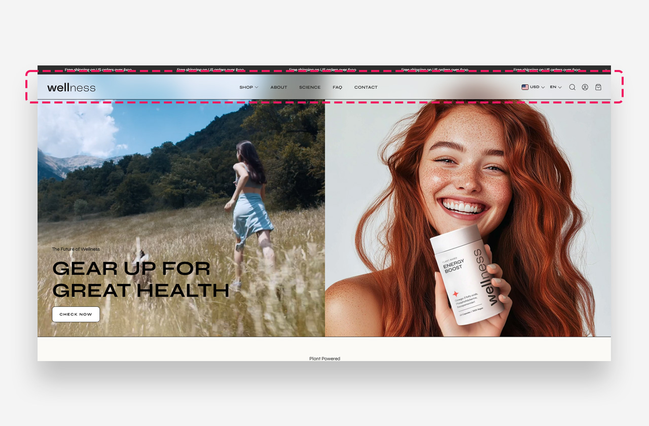
- Layout – Choose the layout of the header. Available options are Logo left, menu below; Logo center, menu below; Logo center, drawer menu; Transparent menu; and Transparent menu, logo left. Note that the Transparent menu option only works if the Image Banner or Logo Banner section is set as the first section on the page.
- Enable sticky page header – Enable this toggle to keep the header fixed at the top of the screen as the visitor scrolls down.
- Sticky header always visible – Enable this toggle to make the sticky header permanently visible instead of auto-hiding on scroll.
- Sticky header background opacity – Set the opacity of the header background color when sticky. Works only with the Transparent menu and Logo center, drawer menu layout settings.
- Sticky header background blur – Set the blur intensity of the header background when sticky. Works only with the Transparent menu and Logo center, drawer menu layout settings.
- Always blur header – Enable this toggle to apply the blur effect across all sections, including those within the Header Group.
- Show separator line – Enable this toggle to display a dividing line below the header. This setting is not visible on the homepage when the Transparent Menu layout is used.
- Show shadow – Enable this toggle to display a shadow beneath the header. This setting is not visible on the homepage when the Transparent Menu layout is used.
Header Logo
- Logo image – Upload the logo image displayed in the header.
- Large screen logo width – Set the width of the logo on desktop.
- Mobile screen logo width – Set the width of the logo on mobile devices.
- Menu – Select the navigation menu displayed in the header.
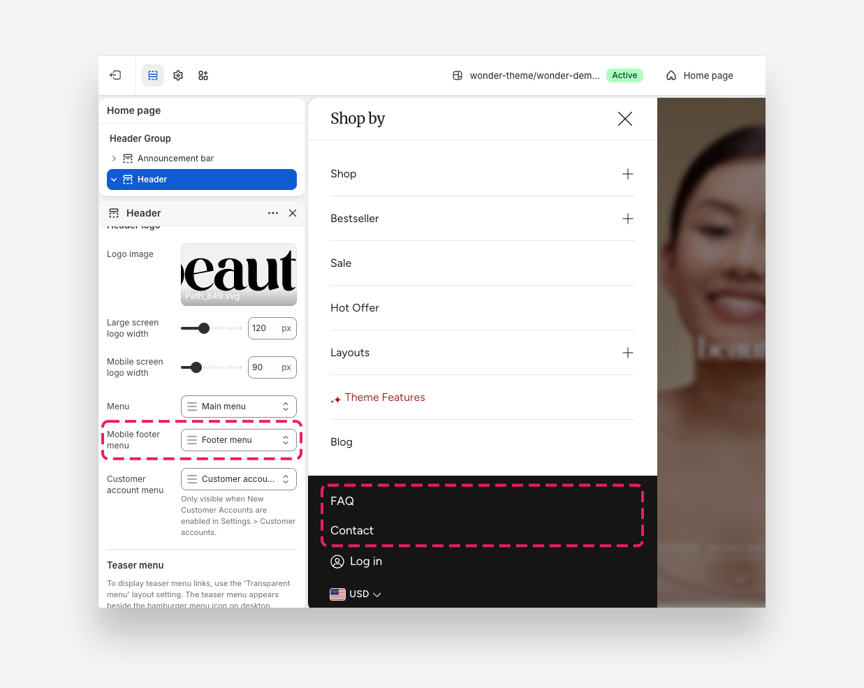
- Mobile footer menu – Select the menu displayed in the mobile footer drawer.
- Customer account menu – Select the menu used for customer account navigation. Only visible when New Customer Accounts are enabled in Settings > Customer accounts.
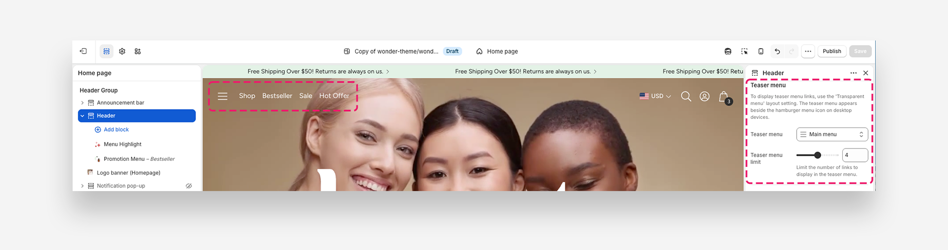
Teaser Menu
To display teaser menu links, use the Transparent menu layout setting. The teaser menu appears beside the hamburger menu icon on desktop devices.
- Teaser menu – Select the menu to display as the teaser menu.
- Teaser menu limit – Set the maximum number of links to display in the teaser menu.
Transparent Header
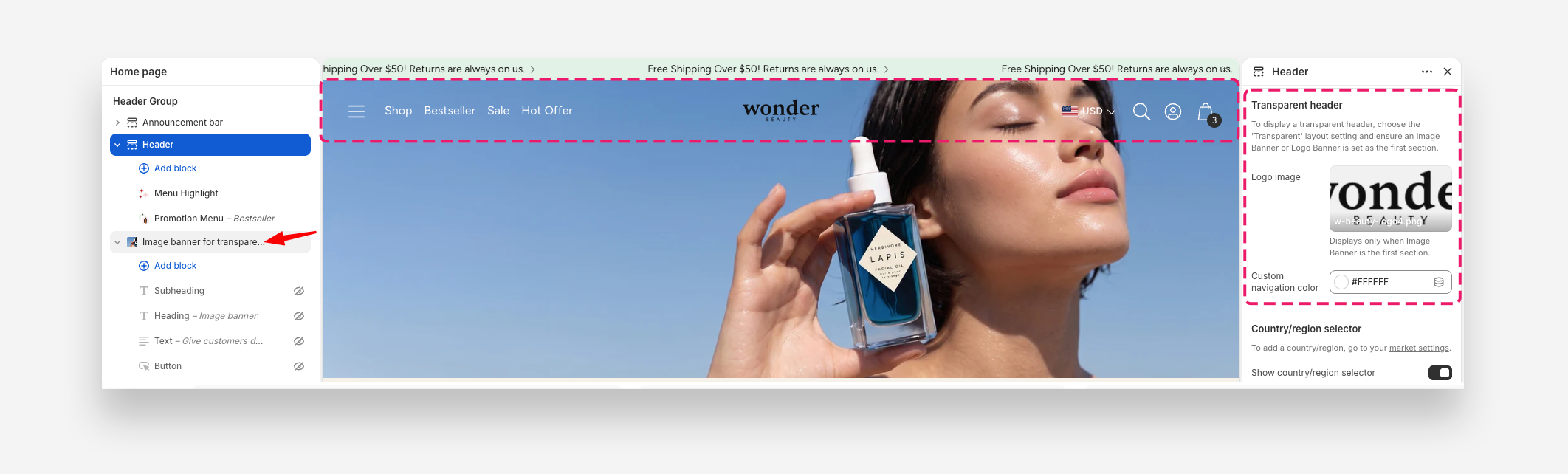
To display a transparent header, choose the Transparent menu layout setting and ensure the proper section is select as the first section. For a better effect, we recommend enabling the sticky page header
- Logo image – Upload the logo displayed when the transparent header is active. Displays only when an Image Banner is the first section.
- Custom navigation color – Set the color of the navigation links in the transparent header. The Transparent value inherits from global settings by default.
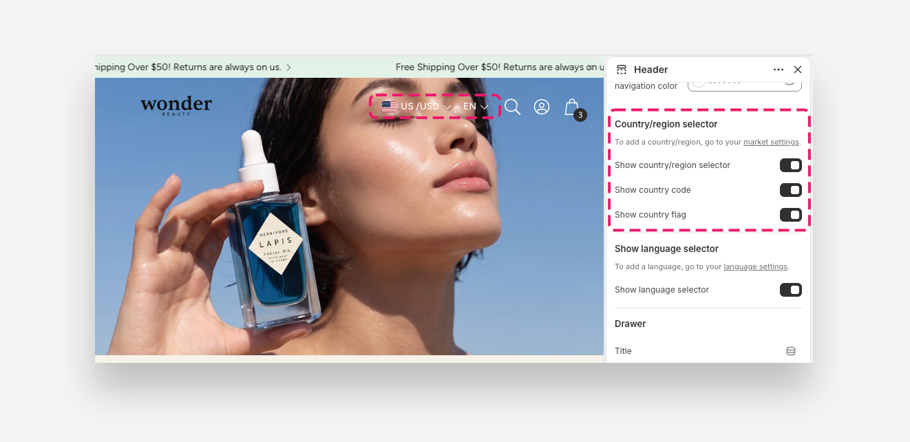
Country/Region Selector
To add a country or region, go to your market settings.
- Show country/region selector – Enable this toggle to display the country or region selector in the header.
- Show country code – Enable this toggle to display the country code alongside the selector.
- Show country flag – Enable this toggle to display the country flag alongside the selector.
Language Selector
To add a language, go to your language settings.
- Show language selector – Enable this toggle to display the language selector in the header.
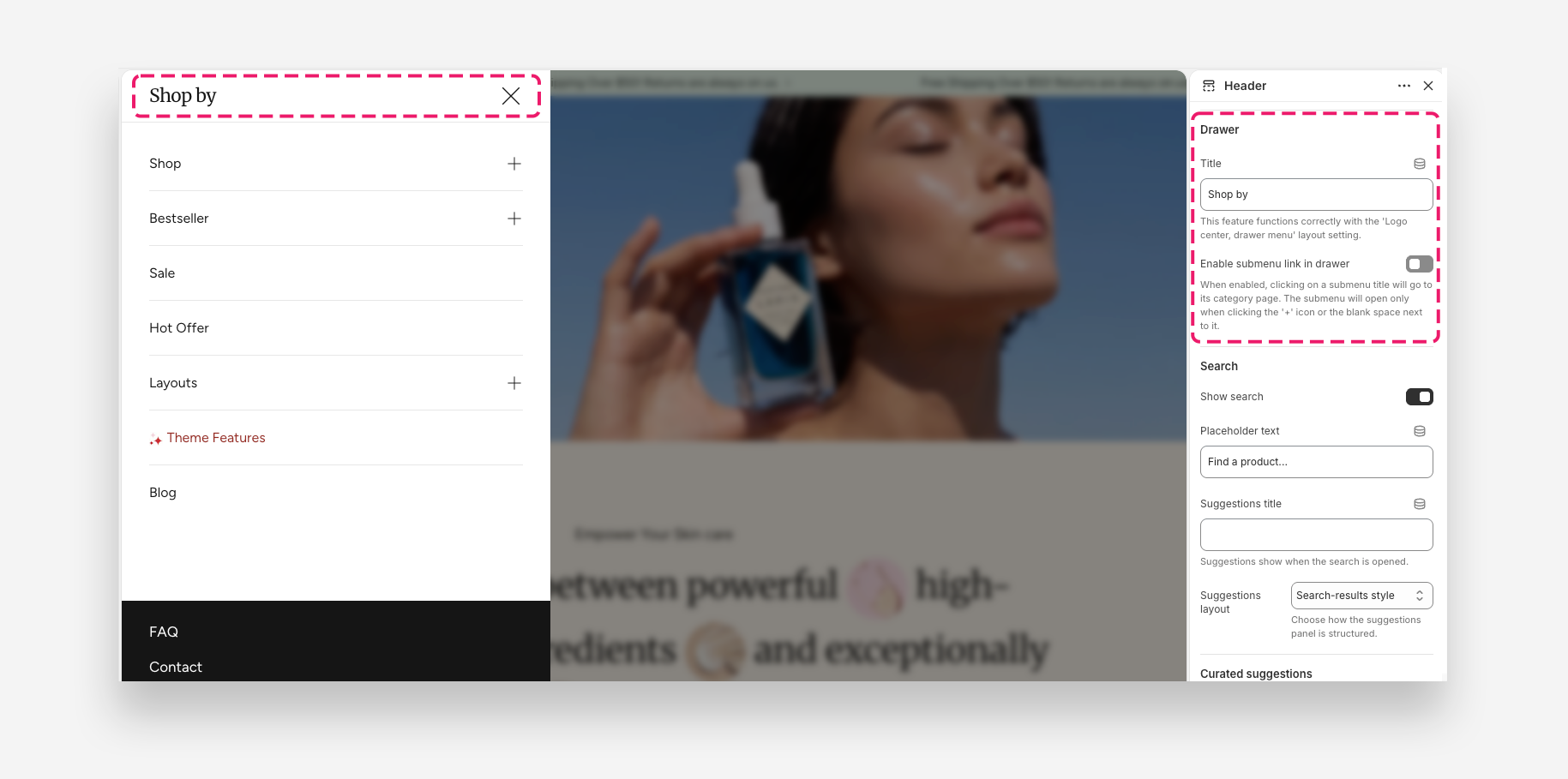
Drawer
- Title – Set the greeting or title text displayed at the top of the drawer menu. This feature functions correctly with the Logo center, drawer menu layout setting.
- Enable submenu link in drawer – Enable this toggle to allow clicking a submenu title to navigate to its category page. When enabled, the submenu will open only when clicking the + icon or the blank space next to it.
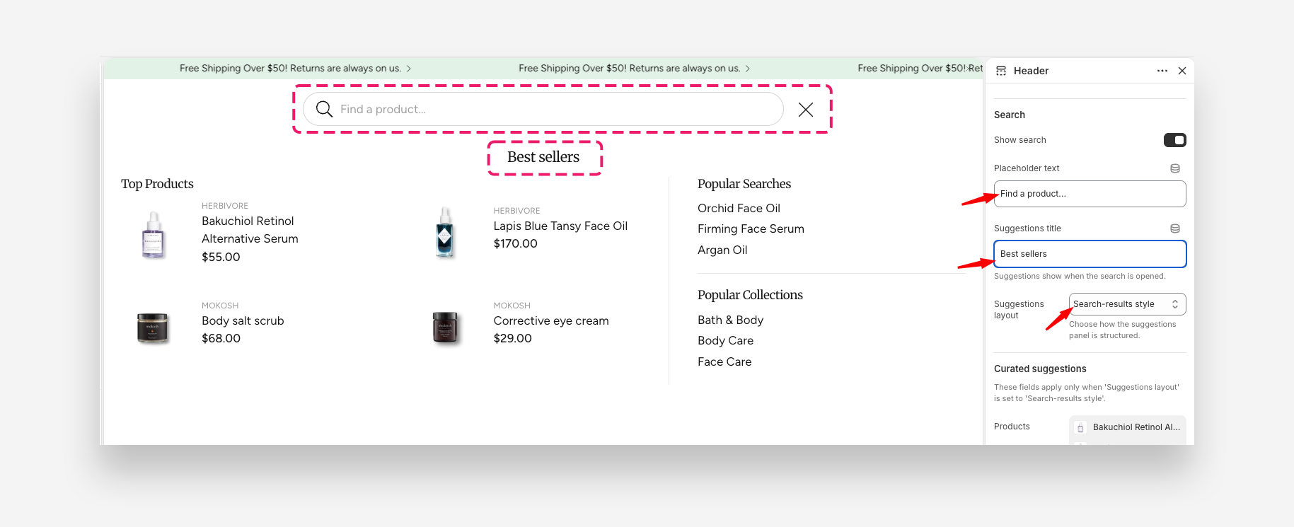
Search
- Show search – Enable this toggle to display the search bar in the header.
- Show search without button on desktop – Enable this toggle to display the compact mobile-style search field without a Search button on desktop. Only available with the Logo left, menu below layout.
- Placeholder text – Set the placeholder text displayed inside the search input field.
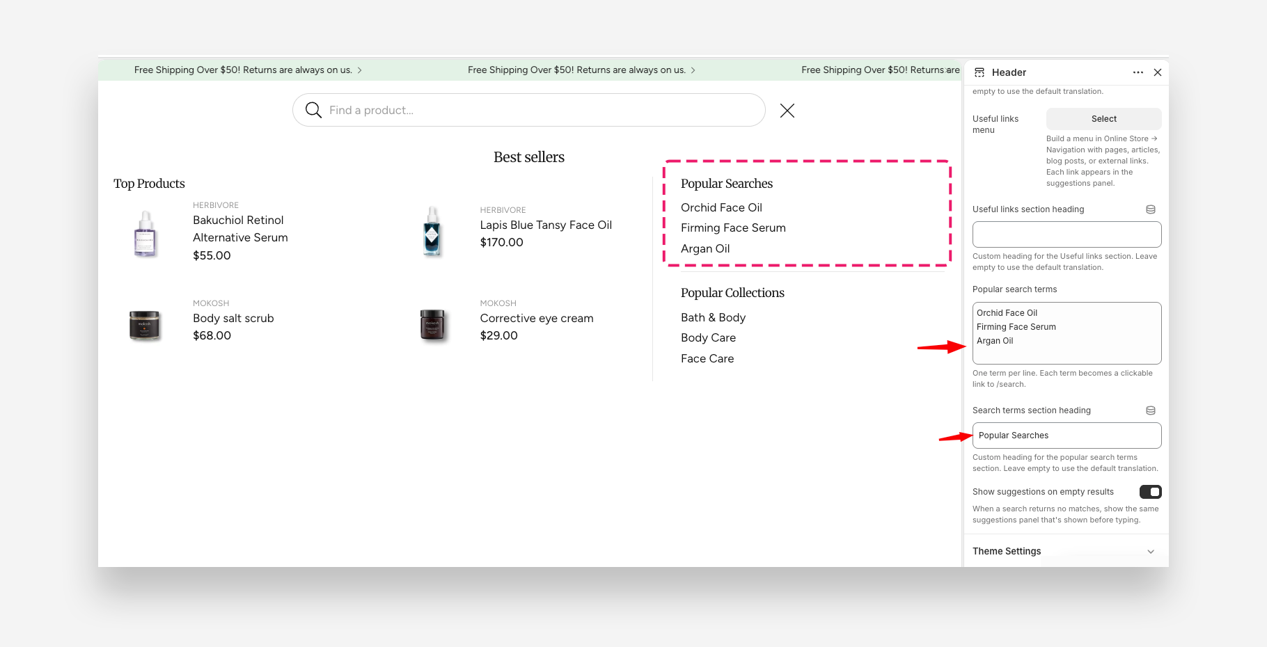
- Suggestions title – Set the heading displayed above the search suggestions panel. Suggestions appear when the search field is opened.
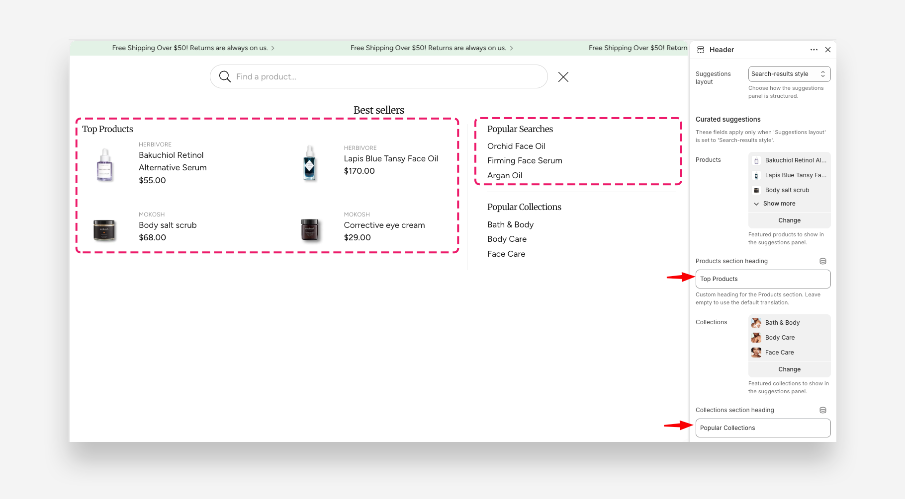
- Suggestions layout – Choose how the suggestions panel is structured. Dropdown menus will display as separate rows, and links to collections and products will show images.
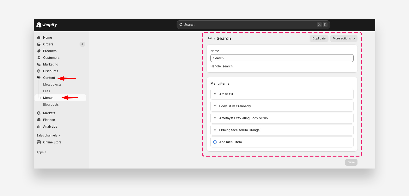
- Suggestions menu – Select the menu whose dropdown items appear as search suggestions.
There are two ways to configure search suggestions:
- Set Suggestions layout to Dropdown menu and select a menu with suggested products. The menu must be created in the Shopify admin panel first.
- Set Suggestions layout to Search-results style and complete the Curated Suggestions fields as shown below.
Curated Suggestions
These fields apply only when Suggestions layout is set to Search-results style.
- Products – Select featured products to display in the suggestions panel.
- Collections – Select featured collections to display in the suggestions panel.
- Show suggestions on empty results – Enable this toggle to display the suggestions panel even when a search returns no matches.