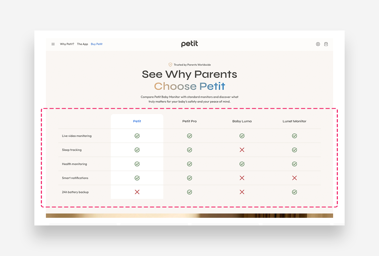
Comparison Table
What is the Comparison Table section?
The Comparison Table section lets you present a side-by-side comparison of your product against competitors or alternative options in a clean, structured layout. Each row represents a feature or attribute, while columns represent the products being compared — making it easy for customers to see your product's advantages at a glance.
Main settings
General
- Heading: Set the title for the Comparison Table section.
- Make section full width: Enable this setting to make the section span the entire width of the page.
Column Headings
- Text style: Choose between Headline or Body style for column headers.
- Number of columns: Set the number of comparison columns (up to 4).
- Column headings: Set individual labels for each column.
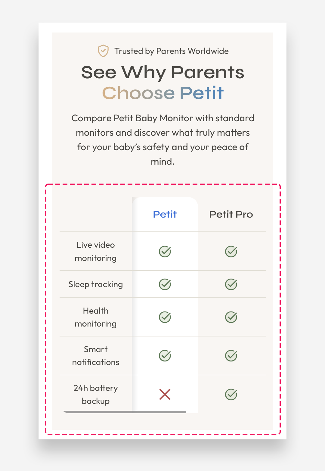
Mobile Version
- Heading scale: Adjust the size of the column headings on mobile.
- Row name scale: Adjust the size of the row labels on mobile.
- Row text scale: Adjust the size of the row content text on mobile.
- Icon / Image scale: Adjust the size of icons or images within cells on mobile.
Colors
- Text color: The 'Transparent' value is the default and inherits from global settings.
- Background color: The 'Transparent' value is the default and inherits from global settings.
- Border color: The 'Transparent' value is the default and inherits from global settings.
First Column Colors
- Background color: Set a distinct background color for the first column.
- Text color: Set a distinct text color for the first column.
Section Spacing
- Distance from the top: Adjust the spacing from the top of the section.
- Distance from the bottom: Adjust the spacing from the bottom of the section.
Mobile view example
Customize row block
Each Table Row represents a single feature or attribute being compared across all columns. You can add as many rows as needed using the "Add Table Row" button.
Row settings:
- Row name: Set the label for the feature being compared, displayed in the first column (e.g. "Vegan", "Recyclable Packaging", "Organic Ingredients").
Per column settings (repeated for each column):
Each column has the following independent settings:
- Text: Enter the value to display in the cell (e.g. "Yes", "No").
- Select Icon: Choose an icon to display instead of text (e.g. "Check mark"). When set, the icon replaces the text content.
- Image: Upload or select an image to display in the cell instead of the icon or text. When set, the image takes priority over both icon and text.
Each cell supports three content types — text, icon, or image — giving you full flexibility to mix and match how information is presented across different rows and columns.