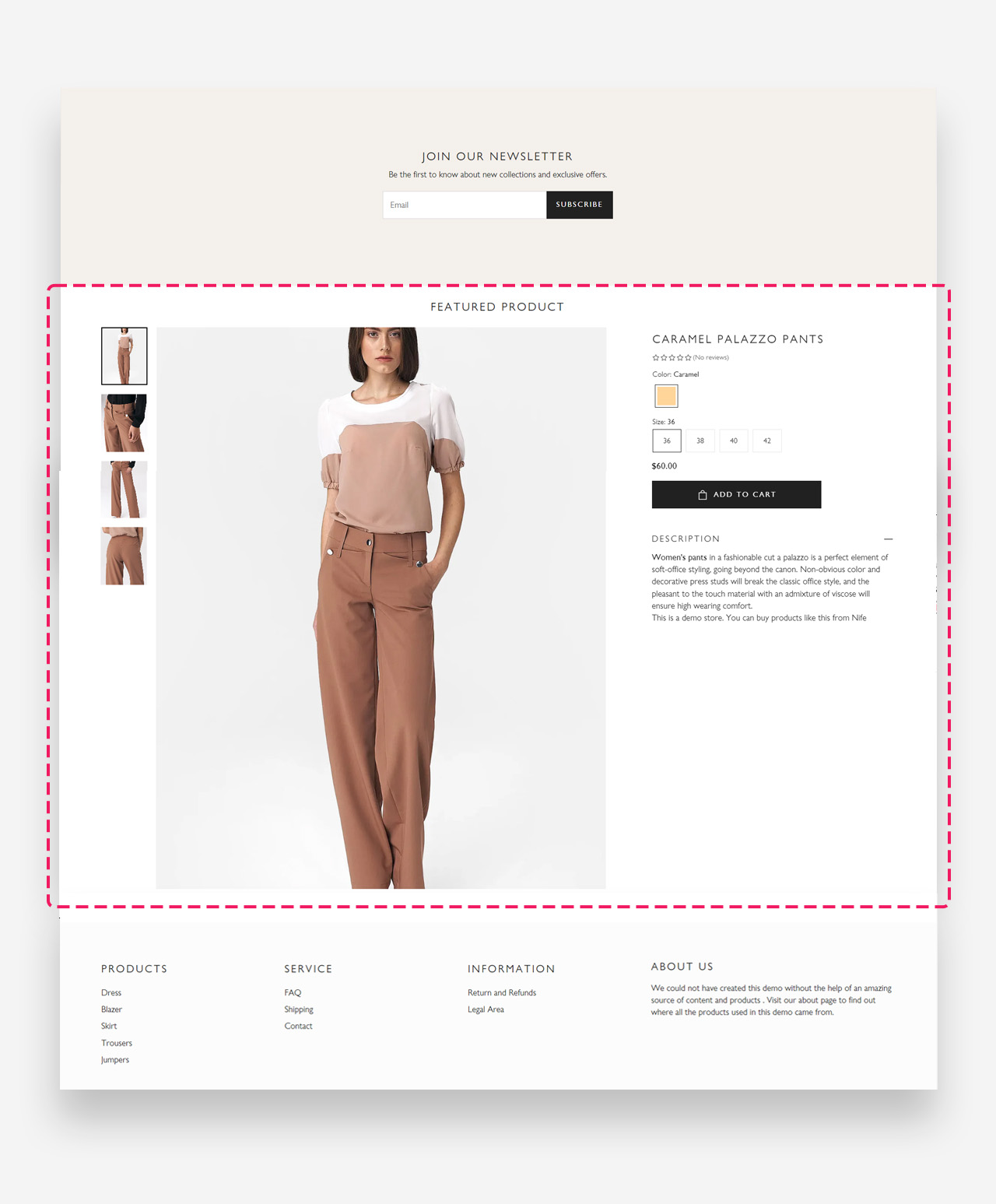
Featured Product
What is the Featured Product section?
Since v1.0.0
The "Featured Product" section serves as a showcase highlight on your Shopify store, drawing customer attention to a chosen item with visual prominence and detailed information. It's a concise yet impactful display, offering a quick glimpse at the product's best features through striking images, essential details, and clear call-to-action buttons. This section is designed to simplify the customer's path from attraction to transaction, accentuating the product and streamlining the purchase process.
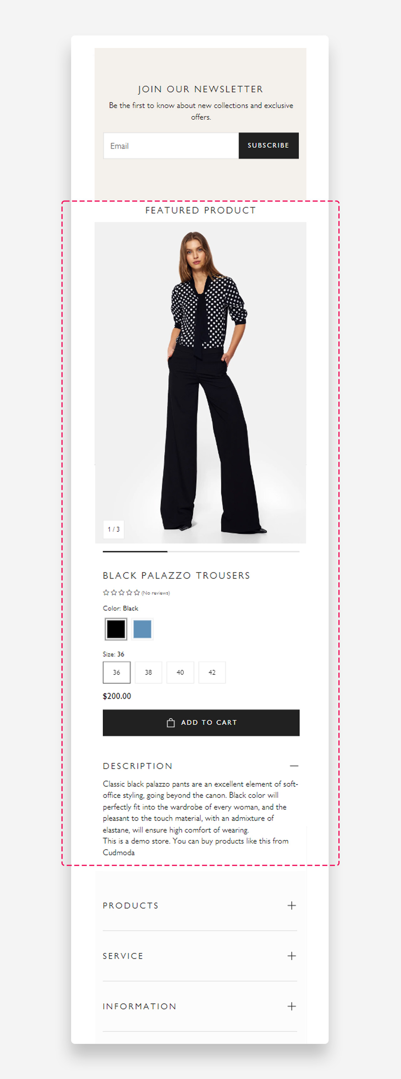
Mobile view example
Main Settings
- Use rich text field for heading: Enable this toggle to use the rich text editor for the heading, which supports bold, italic, links, heading levels (H1–H6 for SEO), and dynamic content.
- Heading: Enter the heading displayed above the featured product.
- Product: Select the product to display in this section.
- Desktop media size: Choose the size of the product media on desktop — Large or Normal.
- Desktop layout: Choose the layout style for the product media on desktop. Options include Carousel with thumbnails and other layout variants.
- Desktop image ratio: Set the aspect ratio of the product images on desktop. Options include Original Size and other ratio presets.
- Enable video looping: Enable this toggle to replay product videos continuously.
- Show default video controls: Enable this toggle to display the browser's native video playback controls.
- Show custom play/pause button: Enable this toggle to display a custom play and pause button over product videos.
- Show custom unmute/mute button: Enable this toggle to display a custom mute and unmute button over product videos.
- Preselect first available variant: Enable this toggle to automatically select the first available variant when the page loads.
- Enable image zoom: Enable this toggle to allow visitors to zoom into product images on hover or tap.
Mobile Version
- Mobile image: Choose the size of the product media on mobile — Normal or Small.
- Show thumbnails on mobile: Enable this toggle to display thumbnail navigation for product images on mobile devices.
Section Spacing
- Top distance: Set the top spacing above the section content in pixels.
- Bottom distance: Set the bottom spacing below the section content in pixels.
- Show custom mobile spacing: Enable this toggle to reveal separate top and bottom spacing controls for mobile devices.
- Distance from the top mobile: Set the top spacing above the section on mobile devices in pixels. Only applied when custom mobile spacing is enabled.
- Distance from the bottom mobile: Set the bottom spacing below the section on mobile devices in pixels. Only applied when custom mobile spacing is enabled.
Customize Blocks
- Title block
- Description block
- Variant picker block
- Price block
- Rating block
- Buy button block
- Separator block
- Bulletpoints block
- Button block
- Collapsible Drawer
- Collapsible files row block
- Collapsible tab row
- Complementary products block
- Countdown with discount code
- Custom Liquid block
- Custom Option block
- Feature icons block
- Feature tags block
- Featured Icon block
- Icon with Text block
- Information Popup block
- Inventory status block
- Payments badge block
- Pickup availability block
- Product Siblings block
- Promo block
- Share buttons block
- SKU block
- Specification table block
- Subscription Widget block
- Text block
- Upsell block
- Video Reels with product block