Shoppable Buy All
What is the Shoppable Buy All section?
Since v2.5.0
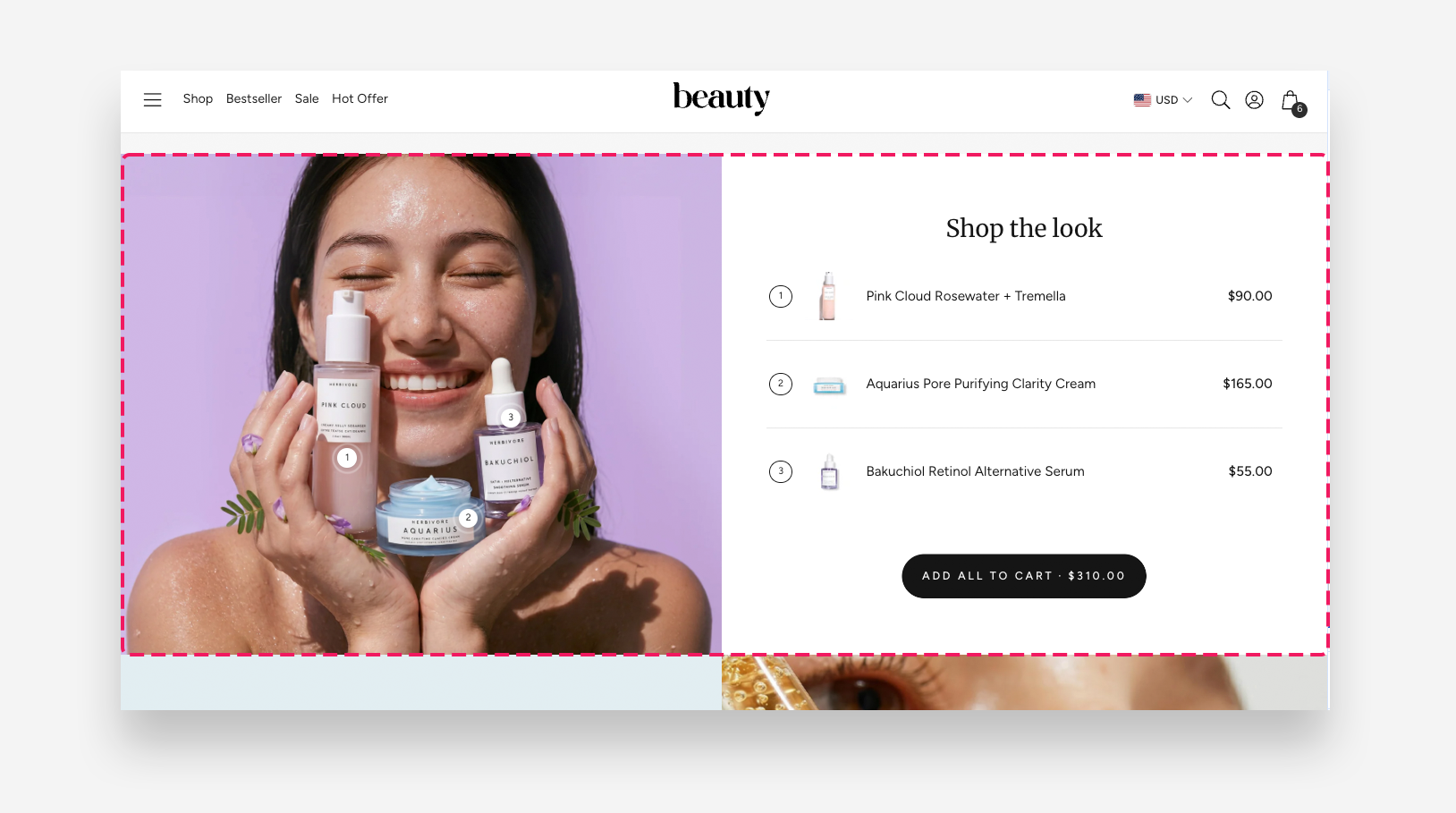
The Shoppable Buy All section displays a lifestyle image with numbered hotspots linked to individual products, allowing customers to shop an entire look with a single click. It combines a visual product list with an "Add all to cart" button, making it easy for customers to purchase multiple items shown in the image at once.
Main settings
General
- Heading: Enter the heading displayed above the product list.
- Heading alignment: Set the horizontal alignment of the heading on desktop — Left, Center, or Right.
- Mobile heading alignment: Set the horizontal alignment of the heading on mobile — Left, Center, or Right.
- Heading scale large screen: Set the size of the heading on desktop.
- Heading scale mobile: Set the size of the heading on mobile devices.
- Show number: Enable this toggle to display numbered markers next to each product in the list.
- Desktop layout: Choose whether the image or text appears first on desktop. Image first is the default mobile layout.
- Desktop percentage image width: Set the percentage of the section width occupied by the image on desktop.
- Make section full width: Enable this toggle to stretch the section to the full width of the screen.
- Image: Upload the lifestyle image displayed in the section.
Section height
- Height: Choose how the section height is determined — Adapt to image or Fixed height.
- Desktop fixed height: Set the fixed height of the section on desktop. Applied only when 'Fixed Height' is selected.
- Mobile fixed height: Set the fixed height of the section on mobile devices. Applied only when 'Fixed Height' is selected.
Buttons
- Shop all button style: Choose the visual style of the "Add all to cart" button — Primary or Secondary.
- Full width on desktop: Enable this toggle to make the button span the full width of the section on desktop.
- Show total price: Enable this toggle to display the combined price of all products in the button label.
Button 2
- Button label: Set the label for the second button.
- Link: Assign a URL or page link to the second button.
- Button style: Choose the visual style of the second button — Primary or Secondary.
- Open link as a new window: Enable this toggle to open the link in a new browser tab.
- Full width on desktop: Enable this toggle to make the second button span the full width of the section on desktop.
Colors
- Text color: Set the text color for the section.
- Background color: Set the background color for the section.
- Background opacity: Adjust the opacity of the background color.
Section Spacing
- Distance from the top: Adjust the spacing above the section.
- Distance from the bottom: Adjust the spacing below the section. Adds distance from the top and the bottom.
- Show custom mobile spacing: Enable this toggle to set separate spacing values for mobile devices.
- Distance from the top mobile: Adjust the spacing above the section on mobile devices. Applied only when Show custom mobile spacing is enabled.
- Distance from the bottom mobile: Adjust the spacing below the section on mobile devices. Applied only when Show custom mobile spacing is enabled.
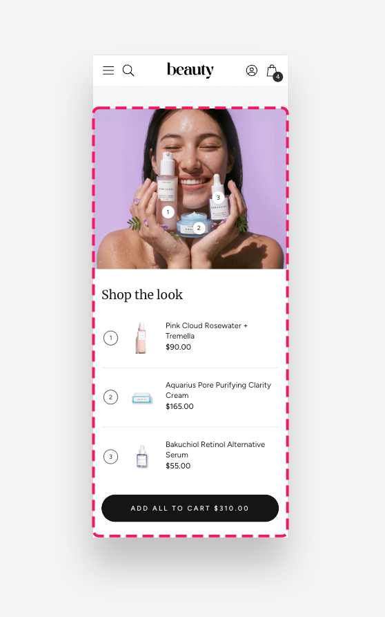
Mobile view example
Blocks
Product Block
The Product block adds an individual product to the shoppable list, along with a hotspot marker positioned on the lifestyle image. Sold-out products are automatically hidden from the section.
- Product: Select the product to display in the list.
- Horizontal position: Move the slider to set the hotspot horizontal position on the image.
- Vertical position: Move the slider to set the hotspot vertical position on the image.
Mobile version
- Horizontal position: Move the slider to set the hotspot horizontal position on the image on mobile devices.
- Vertical position: Move the slider to set the hotspot vertical position on the image on mobile devices.