Collage
What is the Collage section?
Since v1.0.0
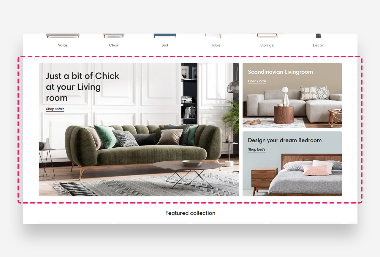
Collage is a creative layout that lets you build a striking, asymmetrical composition of images, text, and call-to-action buttons. It's ideal for showcasing product collections, brand imagery, or promotional graphics in a modern, collage-style format. Each image is its own block with a dedicated heading, description, and link.
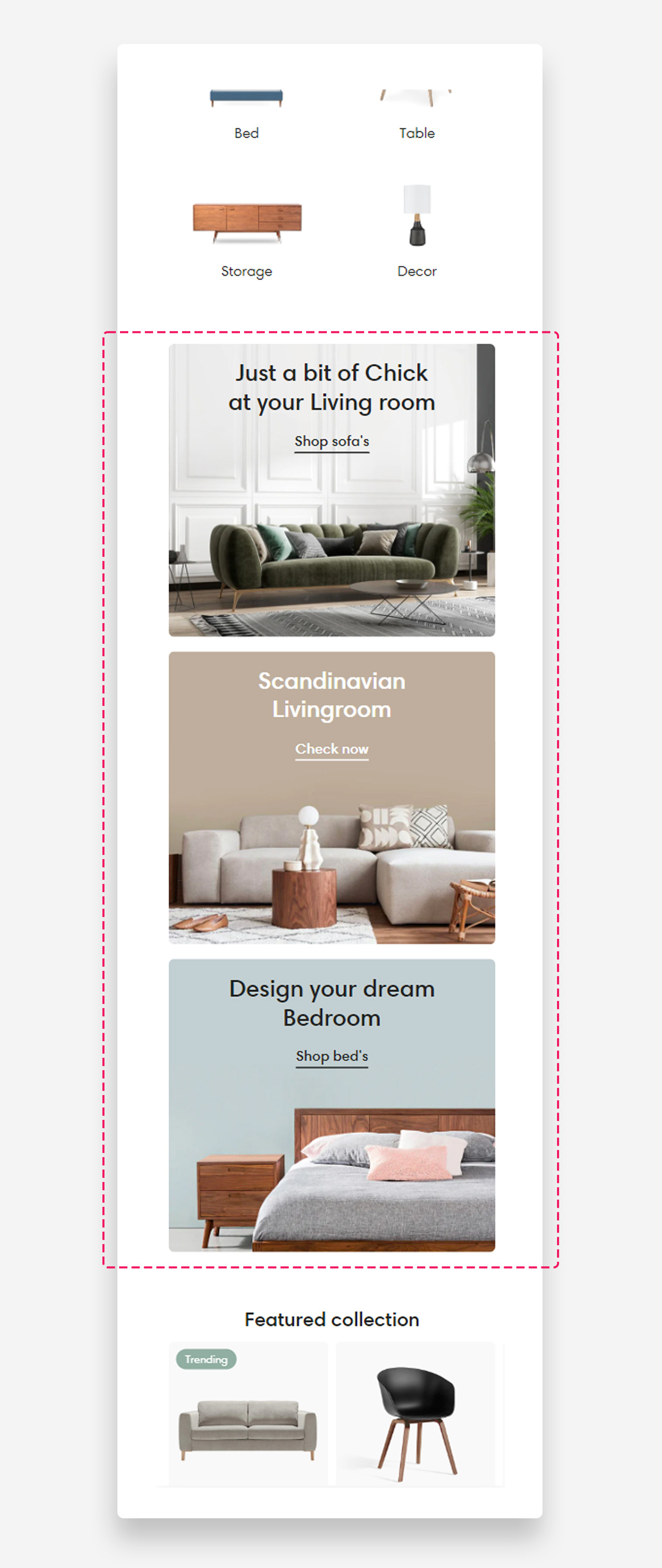
Mobile view example
Main settings
Heading
- Use rich text field for heading: Enable this toggle to use the rich text editor for the heading, which supports bold, italic, links, heading levels (H1–H6 for SEO), and dynamic content.
- Heading: Set the title for the Collage section.
Layout
- Make section full width: Enable this toggle to stretch the section across the full width of the page.
- Component placement scheme: Choose which side the components sit on — Left or Right.
Gap between elements
- Gap between elements (desktop): Set the spacing between elements on desktop — 8px, 16px, or 24px.
- Gap between elements (mobile): Set the spacing between elements on mobile — 4px, 8px, 12px, or 16px.
Colors
- Heading color: Default is Transparent, inheriting value from global settings.
- Section background color: Default is Transparent, inheriting value from global settings.
Section Spacing
- Distance from the top: Adjust the spacing above the section.
- Distance from the bottom: Adjust the spacing below the section.
- Show custom mobile spacing: Enable this toggle to reveal separate top and bottom spacing controls for mobile devices.
- Distance from the top mobile: Set the top spacing above the section on mobile devices in pixels. Only applied when custom mobile spacing is enabled.
- Distance from the bottom mobile: Set the bottom spacing below the section on mobile devices in pixels. Only applied when custom mobile spacing is enabled.
Customize image blocks
Heading and text
- Heading: Set the title overlaid on the image.
- Disable heading on mobile: Hide the heading on mobile devices.
- Heading scale large screen: Adjust the heading font size on desktop as a percentage of the base size.
- Heading scale mobile: Adjust the heading font size on mobile as a percentage of the base size.
- Text: Add a description using the rich text editor.
- Disable on mobile: Hide the text on mobile devices.
Button / link
- Text style: Choose the text style for the button label — Subtitle or Body.
- Style: Choose the button appearance — Underline Link Button, Primary, or Secondary.
- Text: Set the button label.
- Link: Set the destination URL.
Large screen version
- Image: Upload the image displayed on desktop.
- Text alignment: Set the vertical alignment (Top / Center / Bottom) and horizontal alignment (Left / Center / Right) of the text over the image.
Mobile version
- Image: Upload a separate image displayed on mobile.
- Mobile text alignment: Set the vertical and horizontal alignment of the text on mobile.
Block colors
- Text color: Set the color of the text.
- Background color: Set the color of the background overlay.
- Background opacity: Set the opacity of the overlay to improve text legibility over the image.