Collapsible Menu with Image
What is the Collapsible Menu with Image section?
Since v2.3.0
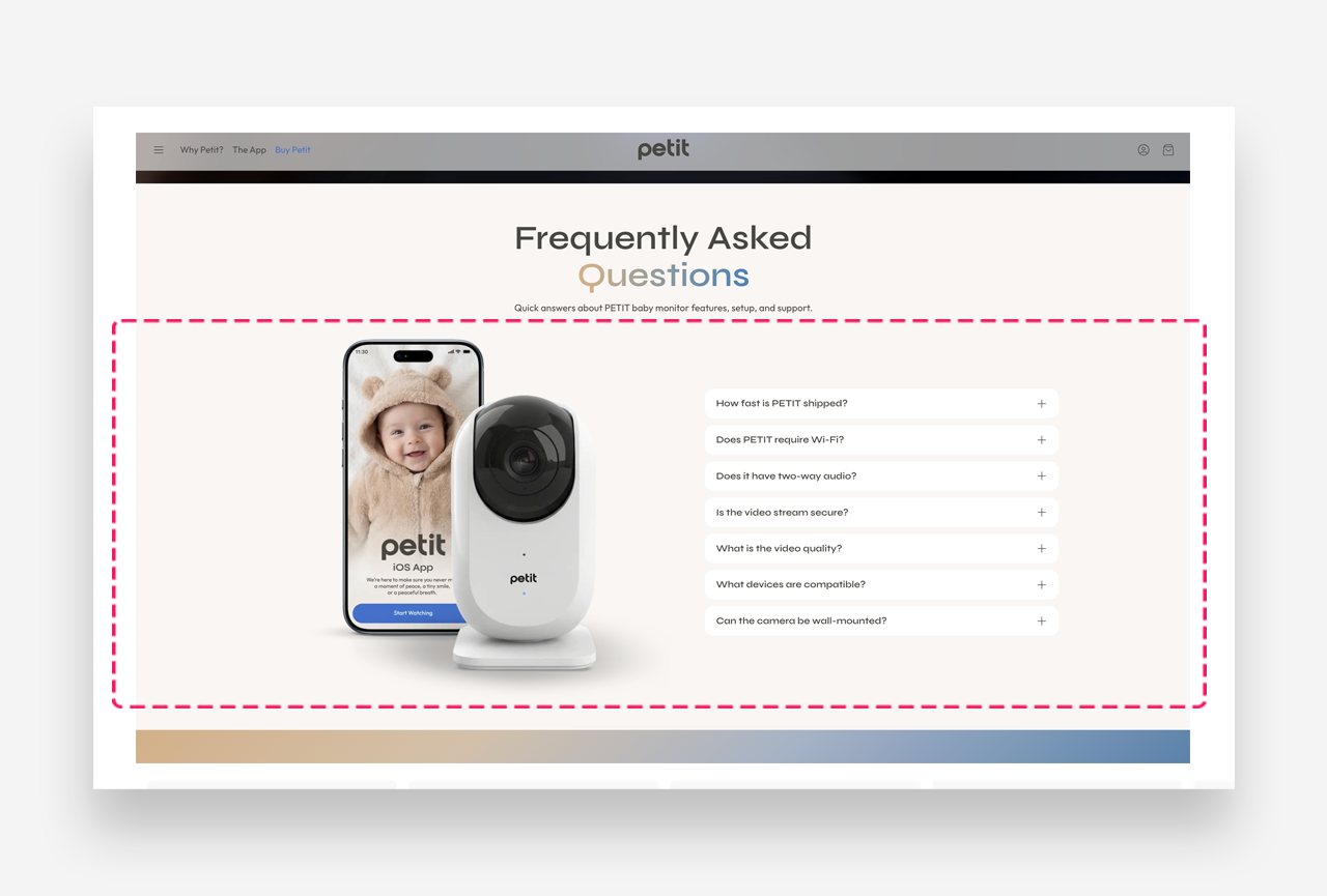
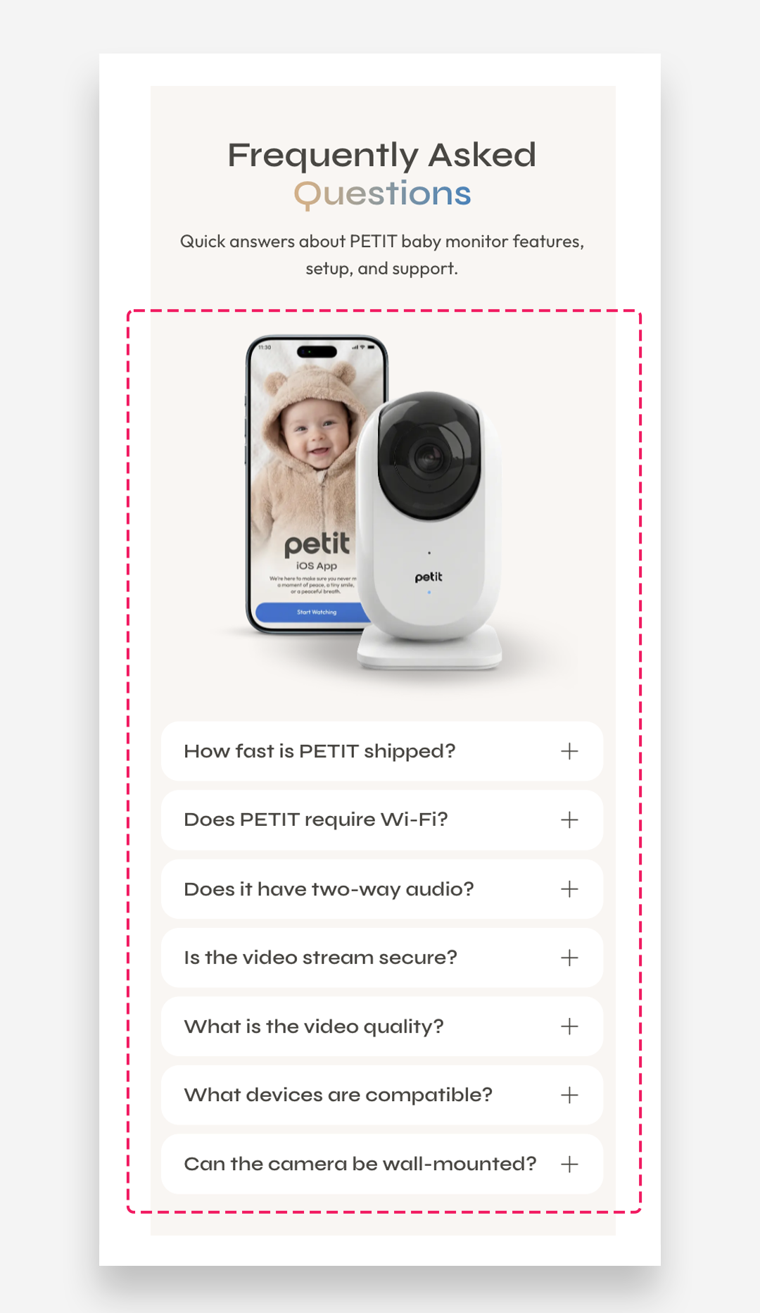
The Collapsible Menu with Image section lets you display an image alongside a set of collapsible content rows — making it ideal for presenting product details like shipping info, care instructions, or size guides in a clean, space-saving layout.
Main settings
General
- Headline: Set the title for the section using the built-in rich text editor (supports heading styles, bold, italic, links, and lists).
- Make the section full width: Toggle on to extend the section to the full width of the page.
- Desktop layout: Choose between Image first or Text first to control which side the image appears on. Note that Image first is always used on mobile regardless of this setting.
- Desktop percentage image width: Use the slider to control how much horizontal space the image takes up on the desktop.
Section Height
- Height: Choose between Adapt to image (the section scales to the image's natural height) or Fixed height (you set an exact pixel value).
- Desktop fixed height: Set the height in pixels for desktop — only applies when Fixed height is selected.
- Mobile fixed height: Set the height in pixels for mobile — only applies when Fixed height is selected.
Large Screen Version
- Shopify-hosted video: Select a video to display instead of an image on large screens.
- Image: Upload or select an image to display on large screens.
Mobile Version
- Shopify-hosted video: Select a video to display on mobile.
- Image: Upload or select a separate image optimized for mobile screens.
Collapsible Row Settings
- Heading font style: Choose between Body or Heading style for the labels of each collapsible row.
- Align rows: Choose how the content inside each collapsible row is vertically aligned — options are Top or Center.
Colors
All color fields default to Transparent, which inherits values from your global theme settings.
- Heading color: Set the color of the section title.
- Section background color: Set the background color of the entire section.
- Background opacity: Adjust the opacity of the background color.
- Text color: Set the color of the body text.
- Collapsible tab background: Set the background color of each collapsible row.
Section Spacing
- Distance from the top: Adjust the spacing above the section.
- Distance from the bottom: Adjust the spacing below the section.
Mobile view example
Customize Collapsible Row Block
Each Collapsible Row represents a single expandable item in the section.
Row Settings
- Heading: Set the label for the collapsible row — this is the text visible to customers before they expand it.
- Tab content: Enter the content revealed when the row is expanded. Supports rich text formatting including font styles, bold, italic, links, and lists.
- Open by default: Toggle this on to have the row already expanded when the page loads, so customers see the content without needing to click.
Icon
Settings for the icon displayed next to the heading.
- Image: Upload a custom image to use as the icon next to the heading.
- Icon: Select a built-in icon to display next to the heading. Set to None to use no icon or to use a custom image instead.
- More icon settings: Toggle on to reveal additional icon customization options.
- Icon scale desktop: Adjust the size of the icon on desktop, in pixels.
- Icon scale mobile: Adjust the size of the icon on mobile, in pixels.
- Icon top margin desktop: Set the top margin of the icon on desktop, in pixels, to fine-tune its vertical alignment relative to the heading.
- Icon top margin mobile: Set the top margin of the icon on mobile, in pixels, to fine-tune its vertical alignment relative to the heading.