Parallax section
What is the Parallax section?
Since v1.0.0
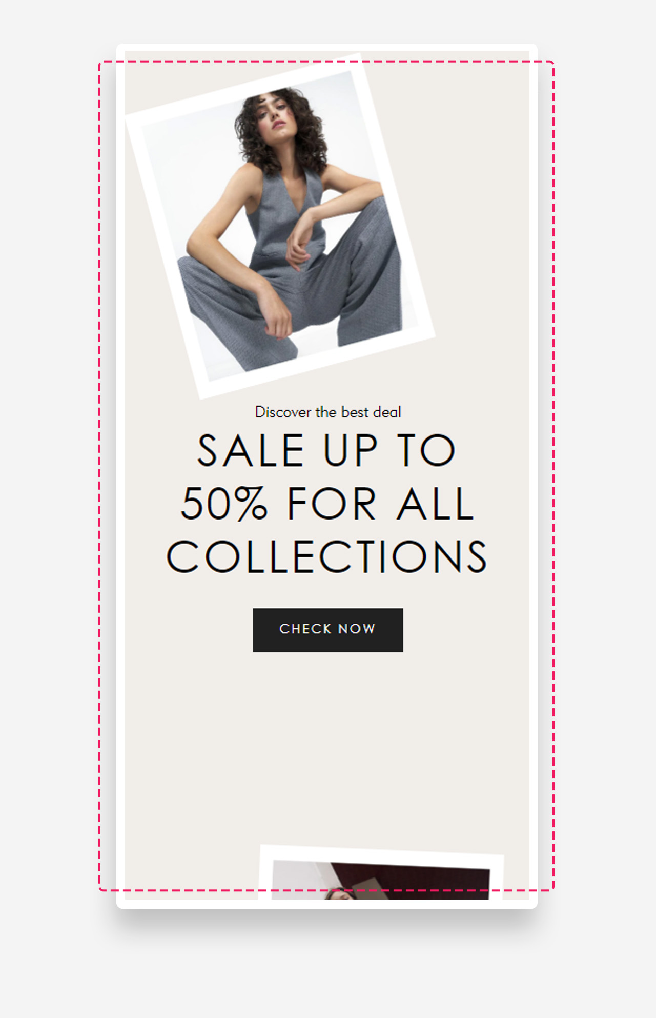
The "Parallax" section is a dynamic and visually captivating element designed to enhance user engagement. This section allows you to set a custom heading, text, and button. You can upload two images that create a parallax effect, revealing themselves as the user scrolls. Additionally, you can adjust the angle of the images, set a background color, and customize the text color, making it a versatile tool for creating a striking and interactive visual experience on your store.
Main settings
General
- Text alignment: Set the horizontal alignment of the text within the section — left, center, or right.
Images
- Number of images: Choose how many images are displayed in the parallax effect — 2, 3, or 4. The number of image and image link fields shown below will adjust depending on this selection — for example, selecting 4 will reveal fields for a third and fourth image and their corresponding links.
- Maximum rotation: Set the maximum rotation angle (in degrees) applied to the images for the parallax effect.
- First image: Upload the first image displayed in the section.
- First image link: Assign a URL or page link to the first image.
- Second image: Upload the second image displayed in the section.
- Second image link: Assign a URL or page link to the second image.
- Third image: Upload the third image displayed in the section. Available only when Number of images is set to 3 or 4.
- Third image link: Assign a URL or page link to the third image. Available only when Number of images is set to 3 or 4.
- Fourth image: Upload the fourth image displayed in the section. Available only when Number of images is set to 4.
- Fourth image link: Assign a URL or page link to the fourth image. Available only when Number of images is set to 4.
Colors
- Text color: Set the text color for the section. Defaults to the value set in global settings.
- Background color: Set the background color for the section. Defaults to the value set in global settings.
Section spacing
- Distance from the top – Adjust the spacing above the section.
- Distance from the bottom – Adjust the spacing below the section. Adds distance from the top and the bottom.
- Show custom mobile spacing: Enable this toggle to set separate spacing values for mobile devices.
- Distance from the top mobile: Adjust the spacing above the section on mobile devices. Applied only when Show custom mobile spacing is enabled.
- Distance from the bottom mobile: Adjust the spacing below the section on mobile devices. Applied only when Show custom mobile spacing is enabled.
Customize heading block
Click one of the preloaded heading block to customize it.
Customize subheading block
Click one of the preloaded subheading block to customize it.
General
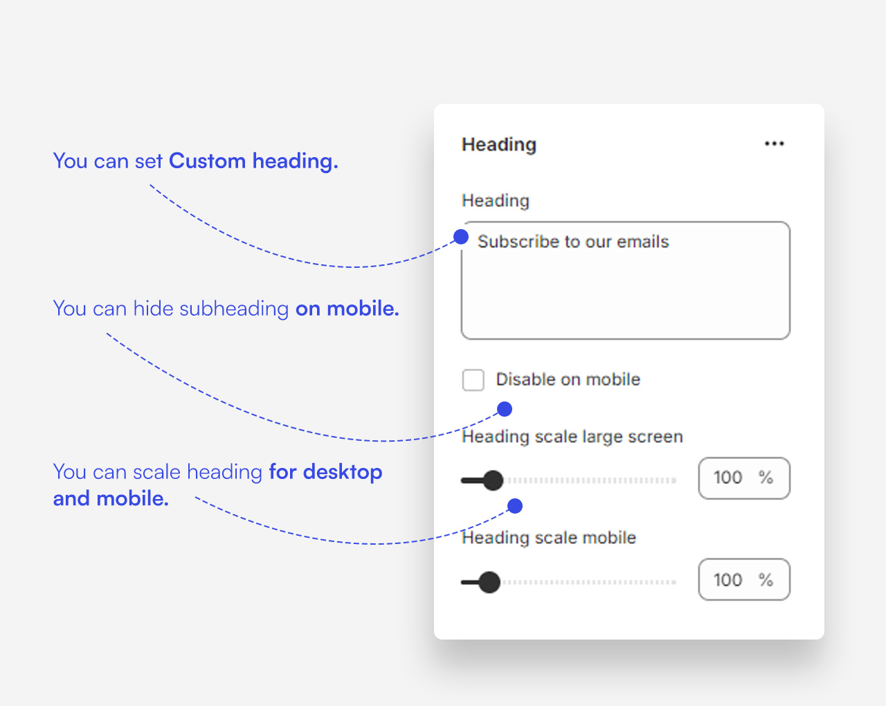
- Subheading: Enter the subheading text displayed in the block.
- Disable on mobile: Enable this toggle to hide the subheading on mobile devices.
- Subheading advanced settings: Enable this toggle to reveal additional subheading style controls. Settings below are only applied when this option is enabled.
- Text style: Choose the text style of the subheading — subtitle or body.
- Text uppercase: Enable this toggle to display the subheading in uppercase letters.
- Letter spacing: Set the spacing between letters in the subheading.
Large screen version
- Text scale large screen: Set the size of the subheading text on desktop.
Mobile version
- Text scale mobile screen: Set the size of the subheading text on mobile devices.
Customize Button block
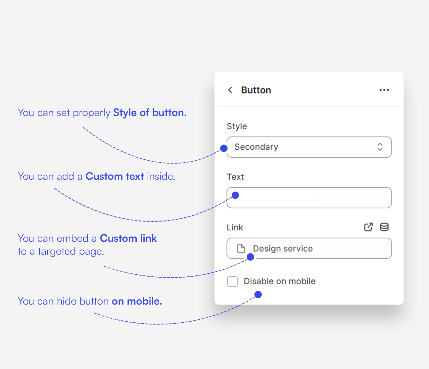
Click one of the preloaded Button block to customize it.
Mobile view example