Multicolumn
What is the Multicolumn section?
Since v1.0.0
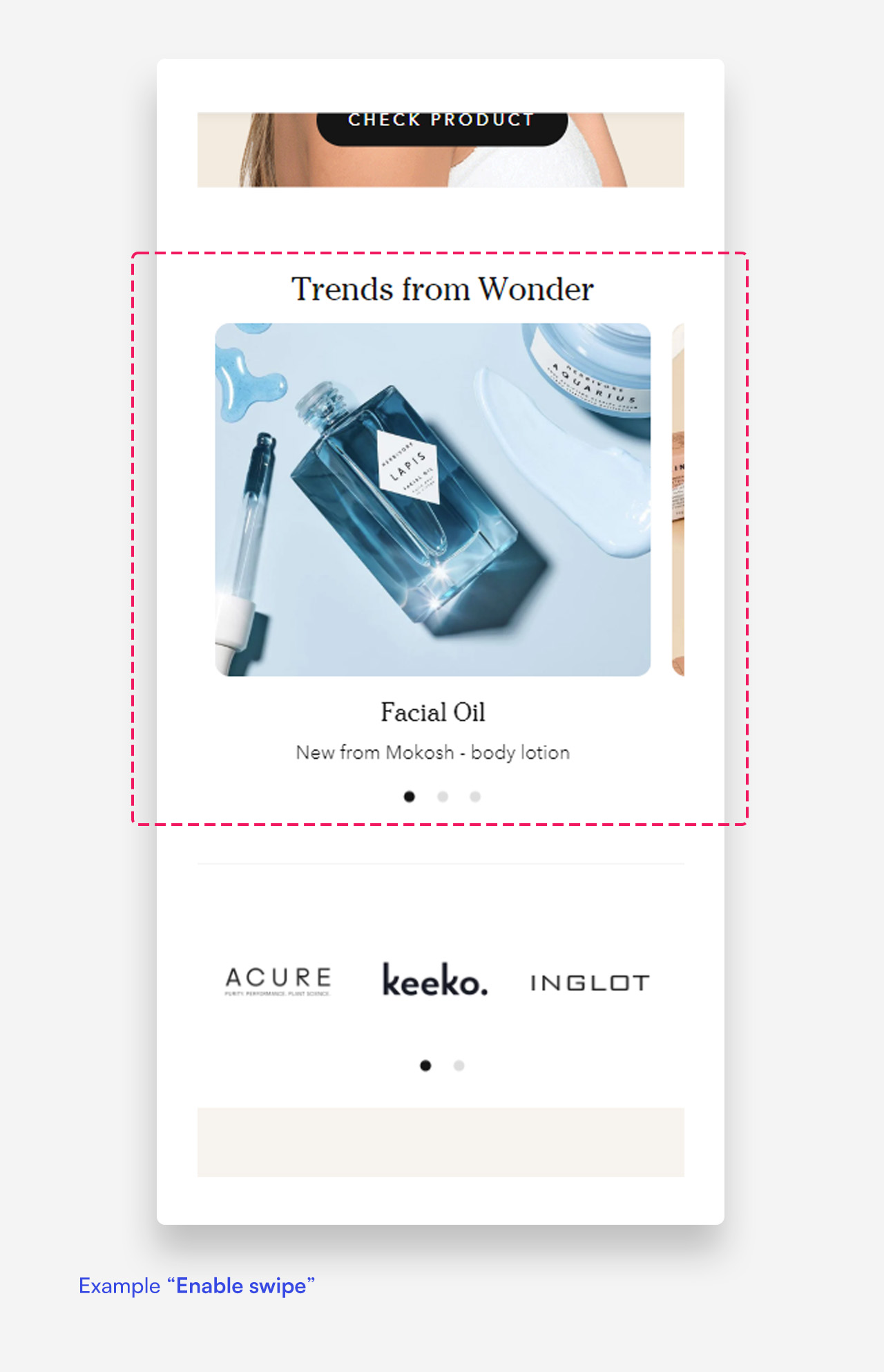
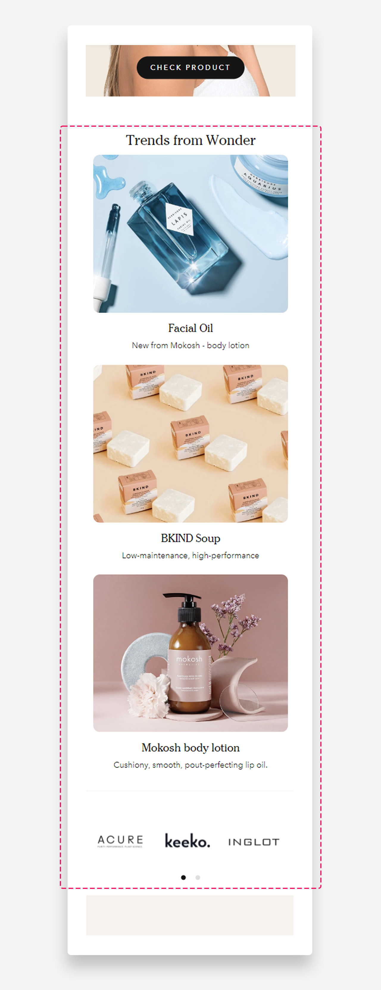
The "Multicolumn" section provides a structured, grid-like display, ideal for featuring multiple products, categories, or content blocks in a clean and organized manner. This layout allows for several columns, each with its own image, text, and button.
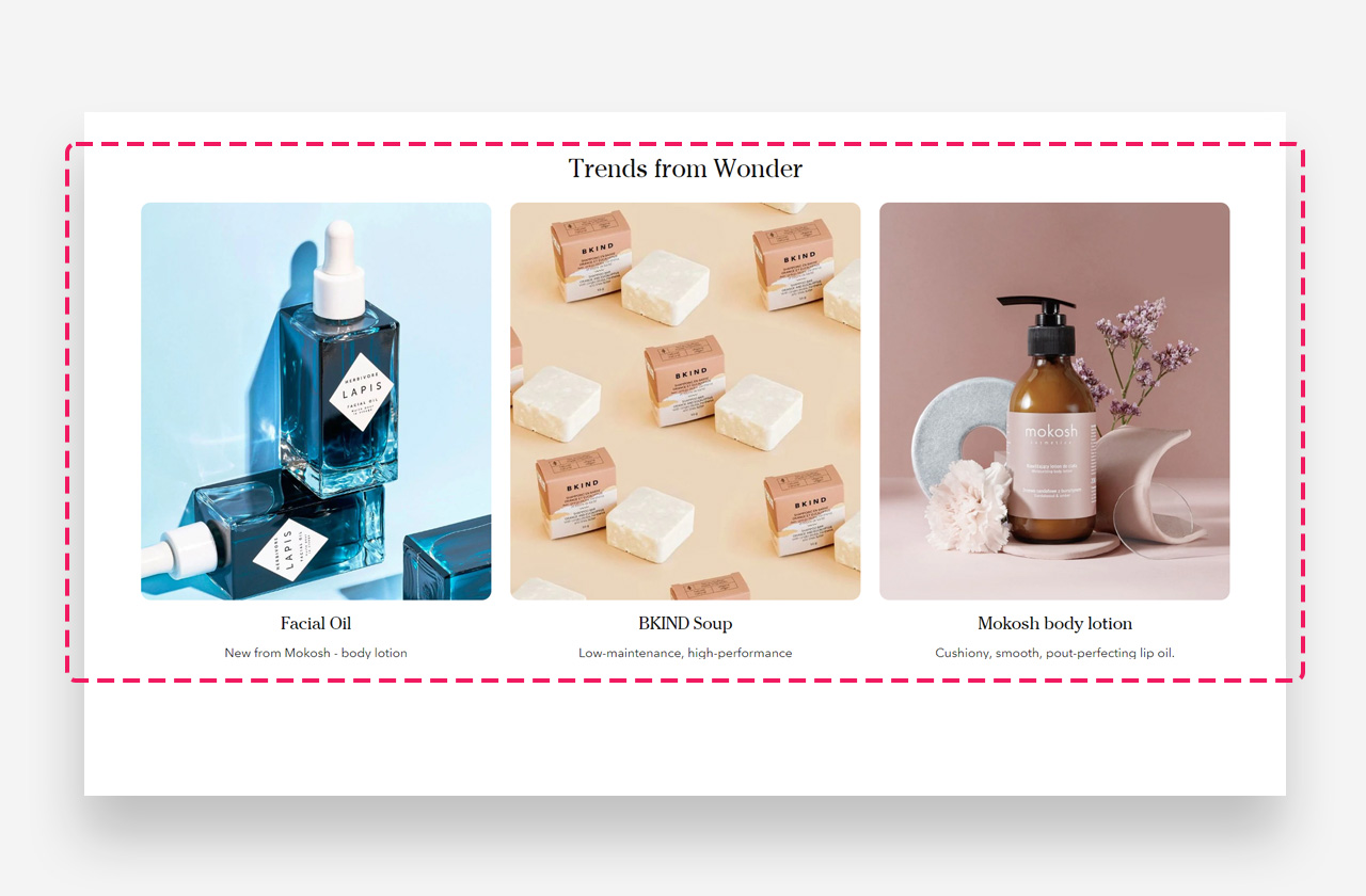
Mobile view example
Main Settings
General
- Use rich text field for heading: Enable this toggle to access text formatting options including bold, italic, links, and heading levels (H1–H6 for SEO), along with dynamic content in the heading field.
- Heading: Set the title displayed above the multicolumn layout.
- Enable stack columns: Enable this toggle to stack the columns vertically instead of displaying them side by side.
- Make section full width: Enable this toggle to make the section span the full width of the container.
- Show default video controls: Enable this toggle to display the default play/pause and mute controls on videos. Controls are clickable only when the section has no content blocks.
- Show custom play/pause button: Enable this toggle to display a custom play/pause button on videos.
- Show custom unmute button: Enable this toggle to display a custom unmute button on videos.
Large screen version
- Columns per row on desktop: Set the number of columns displayed per row on desktop.
- Spacing between columns on desktop: Choose the spacing between columns on desktop — 8px, 16px, or 24px.
Mobile version
- Spacing between columns on mobile: Choose the spacing between columns on mobile — 4px, 8px, 12px, or 16px.
Columns
- Image ratio: Choose the shape of the column images — adapt to image, portrait, or square.
- Column alignment: Set the horizontal alignment of the column content — left or center.
- Heading scale large screen: Set the size of the column heading on desktop.
- Heading scale mobile: Set the size of the column heading on mobile devices.
Colors
- Text color: Set the text color for the section. Defaults to the value set in global settings.
- Background color: Set the background color for the section. Defaults to the value set in global settings.
Section spacing
- Distance from the top – Add spacing above the section to create breathing room.
- Distance from the bottom – Add spacing below the section for better layout balance.
- Show custom mobile spacing: Enable this toggle to reveal separate top and bottom spacing controls for mobile devices.
- Distance from the top mobile: Set the top spacing above the section on mobile devices. Only applied when custom mobile spacing is enabled.
- Distance from the bottom mobile: Set the bottom spacing below the section on mobile devices. Only applied when custom mobile spacing is enabled.
Blocks
Column Block
The Column block adds an individual column within the Multicolumn section, along with a heading, text, button, and image or video. It supports separate media uploads for desktop and mobile, allowing you to display different visuals depending on the screen size.
General
- Heading: Enter the heading text displayed in the column.
- Disable heading on mobile: Enable this toggle to hide the heading on mobile devices.
- Text: Enter the descriptive text displayed below the heading.
- Disable on mobile: Enable this toggle to hide the text on mobile devices.
- Text style: Choose the text style — subtitle or body.
Button
- Style: Choose the visual style of the button.
- Text: Set the button label.
- Disable on mobile: Enable this toggle to hide the button on mobile devices.
- Link: Assign a URL or page link to the button.
- Open link as a new window: Enable this toggle to open the link in a new browser tab.
Large screen version
- A Shopify-hosted video: Select a Shopify-hosted video to display in the column on desktop.
- Image: Upload the image displayed in the column on desktop.
Mobile version
- A Shopify-hosted video: Select a Shopify-hosted video to display in the column on mobile devices.
- Image: Upload the image displayed in the column on mobile devices.
Colors
- Background color: Set the background color of the column. Defaults to the value set in global settings.
- Text color: Set the text color of the column. Defaults to the value set in global settings.