Grid view
What is the Grid view section?
Since v1.0.0
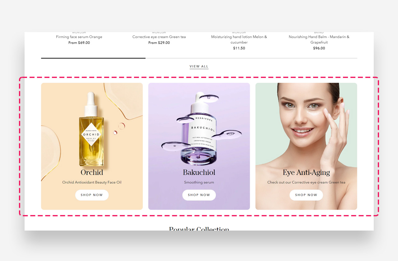
The "Grid view" section offers a neatly organized layout to present a series of images, products, or promotions. With its structured design, it provides a clear and consistent browsing experience for your customers.
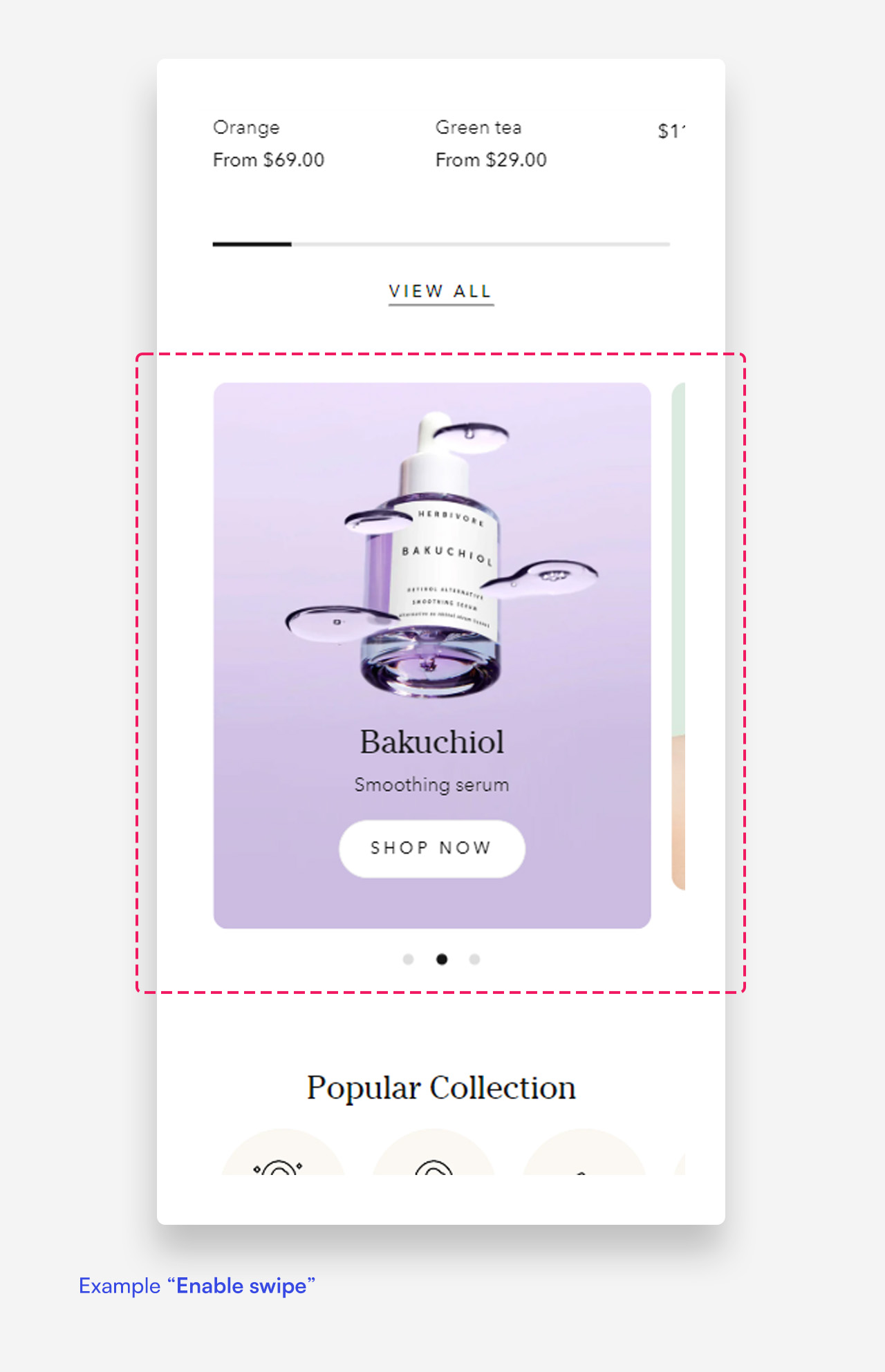
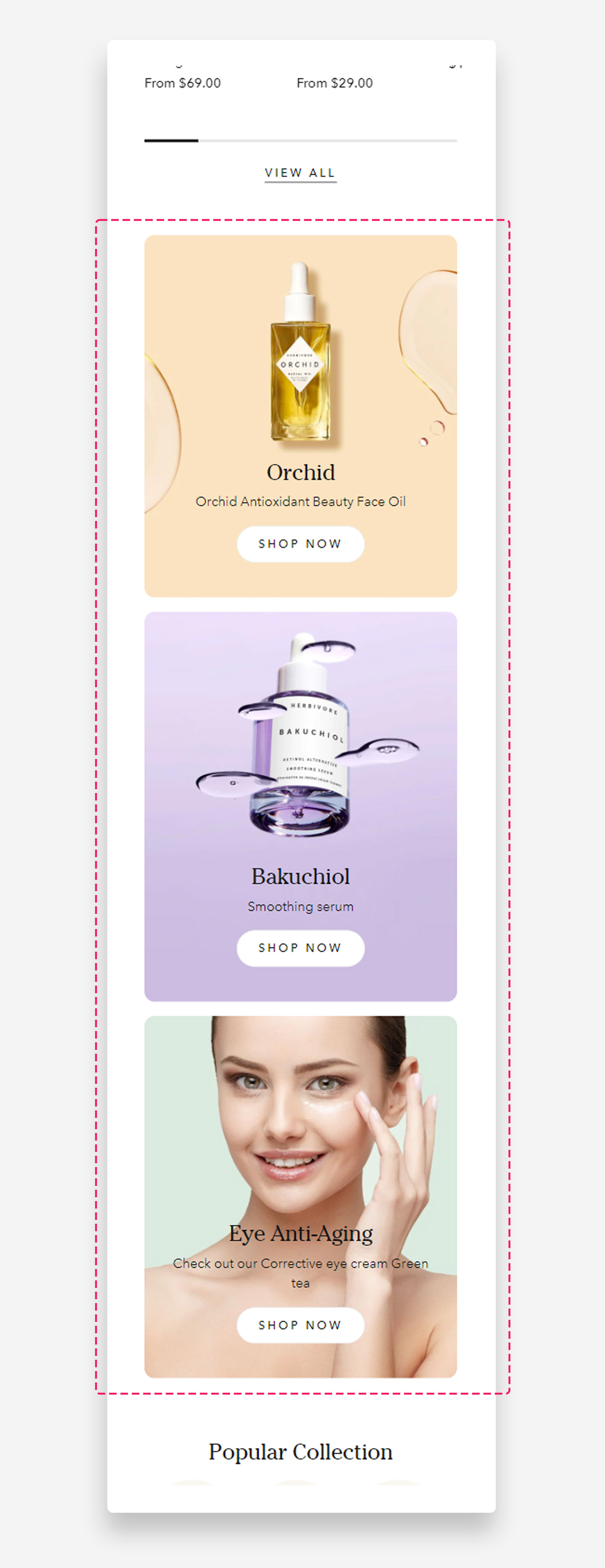
Mobile view example
Main Settings
General
- Heading: Set the title for the grid view section to introduce the grid layout of products or content. Optionally enable the rich text field to access text formatting options including bold, italic, links, and heading levels.
- Enable swipe on mobile: Enable this toggle to allow users to swipe through the grid view on mobile devices.
- Make section full width: Enable this toggle to make the grid view section span the full width of the container.
- Image ratio: Select the image ratio for the grid view — for example, Adapt to image.
- Gap between elements (desktop): Set the spacing between grid elements on desktop.
- Gap between elements (mobile): Set the spacing between grid elements on mobile devices.
Colors
- Text color: Set the text color for the section.
- Background color: Set the background color for the section.
Section Spacing
- Distance from the top: Adjust the spacing from the top of the section.
- Distance from the bottom: Adjust the spacing from the bottom of the section.
- Show custom mobile spacing: Enable this toggle to set separate spacing values for mobile devices.
- Distance from the top mobile: Adjust the spacing from the top of the section on mobile devices. Applied only when Show custom mobile spacing is enabled.
- Distance from the bottom mobile: Adjust the spacing from the bottom of the section on mobile devices. Applied only when Show custom mobile spacing is enabled.
Blocks
Grid Item Block
The Grid item block is a single element within the Grid view section, used to display an image or video along with a heading, subheading, text, and button.
General
- Subheading: Set the subheading text displayed in the grid item.
- Disable on mobile: Hide the subheading on mobile devices.
- Subheading advanced settings: Enable this toggle to reveal additional subheading style controls. Applied only when this setting is enabled.
- Text style: Select the text style for the subheading — Subtitle or Body.
- Text uppercase: Enable this toggle to display the subheading in uppercase letters.
- Letter spacing: Adjust the spacing between letters in the subheading.
- Text scale large screen: Adjust the size of the subheading text on desktop.
- Text scale mobile screen: Adjust the size of the subheading text on mobile devices.
Heading
- Heading: Set the heading text displayed in the grid item.
- Disable heading on mobile: Hide the heading on mobile devices.
- Heading scale large screen: Adjust the size of the heading on desktop.
- Heading scale mobile: Adjust the size of the heading on mobile devices.
Text
- Text: Set the descriptive text displayed in the grid item.
- Disable on mobile: Hide the text on mobile devices.
Button
- Style: Choose the visual style of the button.
- Text: Set the button label.
- Disable on mobile: Hide the button on mobile devices.
- Link: Assign a URL or page link to the button.
- Open link as a new window: Enable this toggle to open the link in a new browser tab.
Colors
- Text color: Set the text color of the button.
- Background opacity: Adjust the opacity level of the grid item's background.
Large Screen Version
- A Shopify-hosted video: Select a Shopify-hosted video to display in the grid item on desktop.
- Image: Upload an image to display in the grid item on desktop.
- Large screen text alignment: Set the vertical (Top, Center, Bottom) and horizontal (Left, Center, Right) alignment of the content on desktop.
Mobile Version
- A Shopify-hosted video: Select a Shopify-hosted video to display in the grid item on mobile devices.
- Image: Upload an image to display in the grid item on mobile devices.
- Mobile screen text alignment: Set the vertical (Top, Center, Bottom) and horizontal (Left, Center, Right) alignment of the content on mobile.