Information Popup block
Since v1.0.0Product page
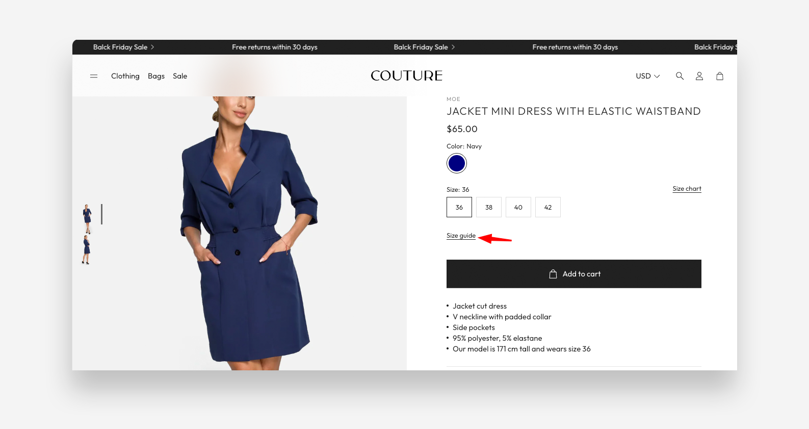
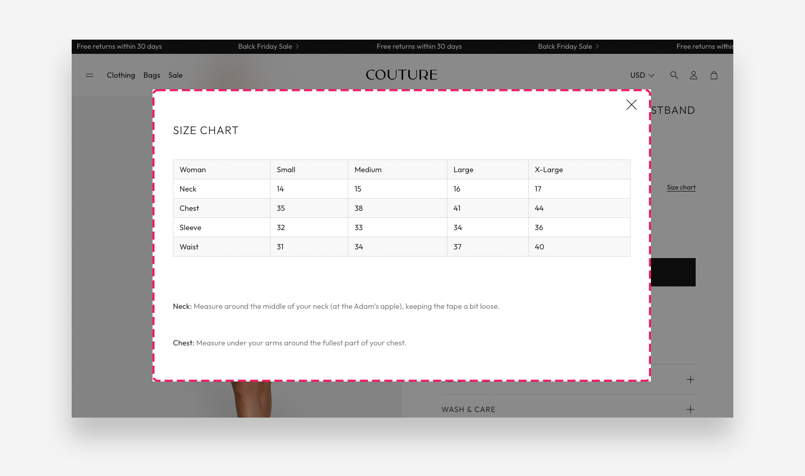
The Information Popup block adds a clickable trigger on the product page that opens a popup overlay with additional product information — such as a size guide, materials table, or any other supplementary content. The popup content can be sourced from a Shopify page or a product metafield.
Settings
- Icon: Choose a built-in icon displayed as the popup trigger — for example Check mark.
- Link text: Enter the label displayed next to the icon that triggers the popup when clicked.
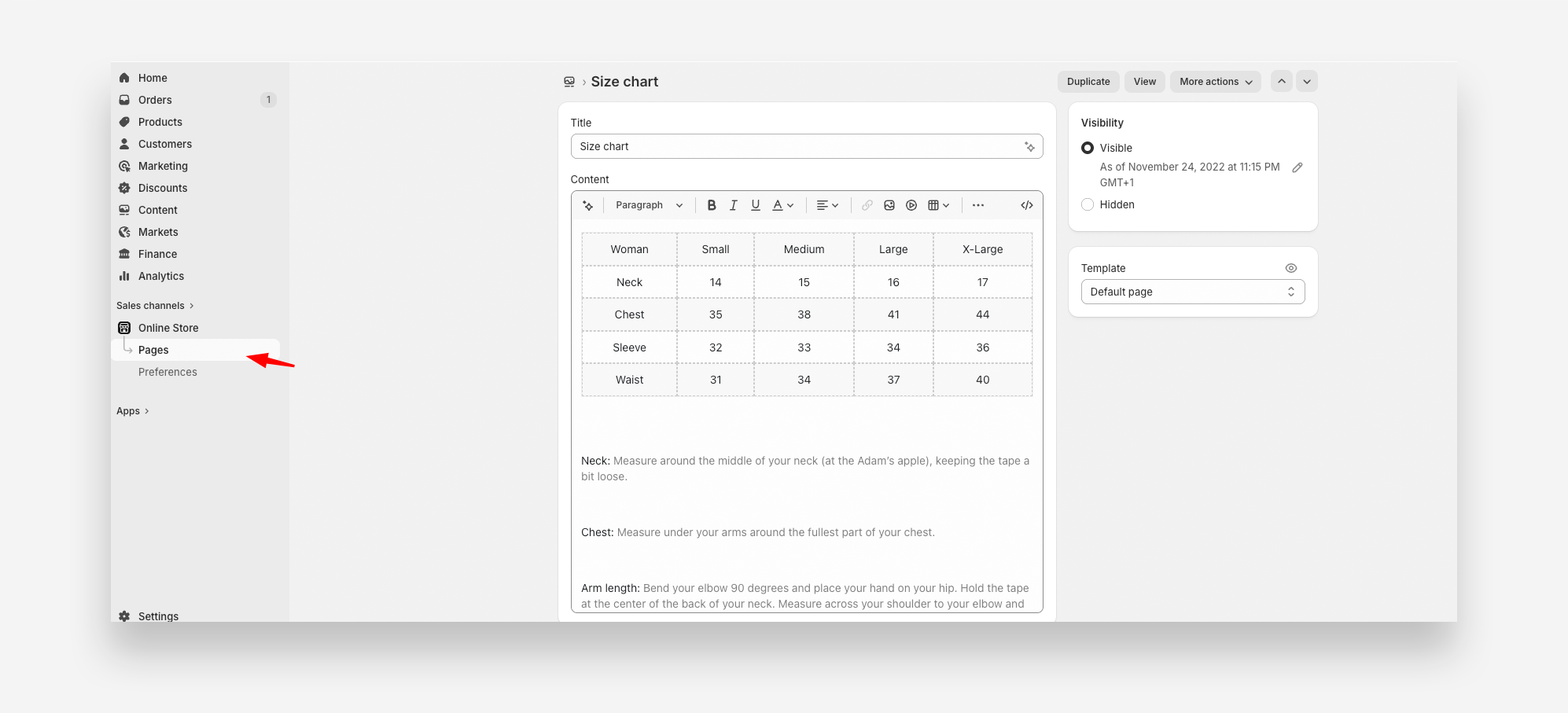
- Content: Select a Shopify page to use as the source of the popup content. You can add text, tables, or images to the selected page.
- Metafield: Enter the metafield namespace and key to retrieve a size chart table, using the format
namespace.key— for examplecustom.size_chart. The metafield type should be multi-line text. - Enable striped rows table layout: Enable this toggle to apply alternating row colors to the table displayed in the popup. When enabled, odd rows will have a grey background.
Using a Shopify Page as Popup Content
You can use any Shopify page as the content source for the popup. This is useful for size guides, ingredient lists, or materials tables that you want to maintain independently and reuse across multiple products.
To set it up:
- In the Shopify Admin, go to Online Store → Pages and click Add page.
- Give the page a descriptive name (e.g., Size Guide or Materials Table).
- Use the page editor to add your content — text, images, or tables are all supported.
- Click Save.
- In the Theme Editor, select the Information Popup block and choose the page you just created in the Content setting.
The popup will display the full content of the selected page whenever a customer clicks the trigger on the product page.